Designing The Bowling Themes – Big Brothers Big Sisters
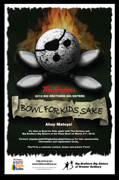
Bit of a throwback with this one. Really, this one job sparked an resurgence in my design career like nothing else has before or since. When Chantal at Big Brothers Big Sisters of Greater Sudbury told me they wanted to do a pirate theme for 2012’s fundraiser, I wasn’t sure how to tackle it. They’d given me carte blanche (which can be pretty scary, you know… constraints can be as comforting as they are frustrating), and her attitude was as it always was – “I know you’ll do a good job.”
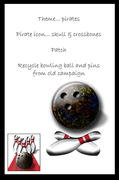
After a little bit of thinking, it dawned on me… what if I made a “skull and crossbones” out of some pins and a bowling ball. Since the ball can take on the look of a face if the holes are laid out properly, it was as good a place to start as any:


-
Raw Materials
I started with just the theme for the costumes. “Pirate”. Need an image. Went with the classic, “Skull and crossbones”. I recycled the pins and ball from a BFKS a few years back. Consistency adds brand strength, and why reinvent the wheel? I’d already spent hours illustrating them. Good to go! - First Pass
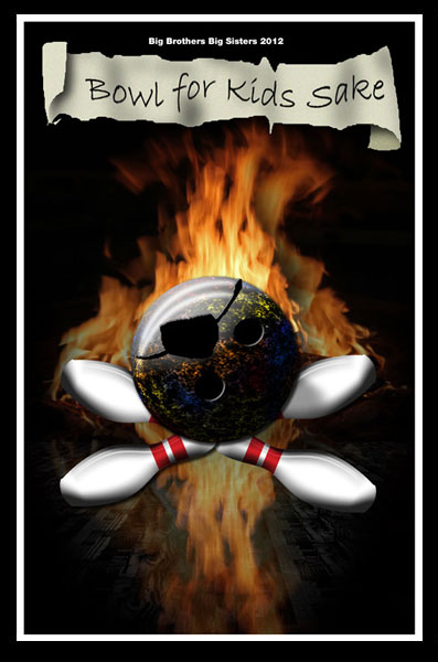
Went with a black background, added flames. No particular reason for the flames; they just looked cool and in Hollywood, pirates and fire go hand in hand. Moved the holes on the ball, added the patch… personified the whole thing. Originally I had a perspective wood paneling underneath the ball, like the bowling lane, but I abandoned that to go with a less literal texture. - Refining the Approach
Went with blue leather behind the skull and crossbones; blue contrasted nicely with the orange of the fire, which I backed off. Added some temporary copy. Practical considerations kicked in – printing would be on a limited budget, so the full colour bleed wouldn’t fly. I went with the ragged white border instead. Added more personality and let me avoid a bleed without simply putting a white border in there that screamed “can’t afford a bleed!” - Zeroing In
The bowling ball was getting lost against the dark background, and it wasn’t really screaming “skull and crossbones” as much as I’d liked. So, I boosted the brightness and was very happy with the emergence of the skull and crossbones. Plus, I didn’t like the blue; was too comfortably contrasting the orange of the fire. But that green, a much more classic marine colour, was a nice shift, adding more tension. Played around with adding a “quote” to make a little more explicit the function of the fundraiser. I knew “booty” wouldn’t fly, but sent it to the client anyways. - Final Product
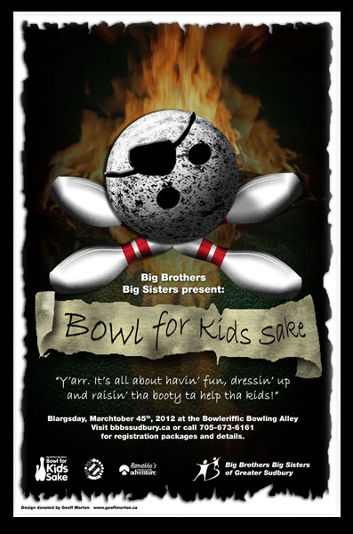
At this point the client gave me some feedback. Some things had to be there. The Tim Hortons sponsorship, the branded bowling logo at the bottom. Rearranged a few things, moved the logos out into the white to separate them from the rest of the illustration. I pared down the copy provided and went to town on the illustration itself. Got rid of the red stripes so they wouldn’t fight with the Tim Hortons logo, aged and darkened the pins. Re-drew the patch and added a ton of shadows to the “skull and crossbones” to ground the whole thing and pull it together. Made the “Bowl for Kids Sake” masthead stronger, added the “X” to mark the spot and sent’er off…
Here’re a few more pieces as they developed.


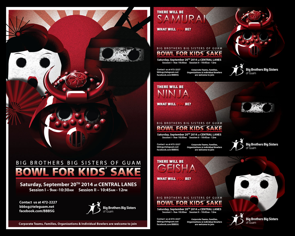
The Japanese theme was later picked up by the BBBS in Guam.


Nobody’s ever picked up this Matrix and Tron-inspired sci-fi one.
That’s okay, I don’t expect it to sell. I really just wanted to capture that digital look.


I’m still waiting for someone to jump on this Steampunk theme.
I think there’s so much potential for fun costumes here… maybe next year.