Developing the Midas Catalogue
I’ve worked on many things large and small during my time at Midas Safety Inc., but the catalogue is probably my defining project. It’s what I was initially hired for, on a six month contract, but almost two and a half years later, I’m still there, so I guess I did something right.

It can be overwhelming, creating something as big as a catalogue (it started out at about 114 pages and ballooned up to 172 all told). What I knew right off the bat though, was that (obviously) the gloves were the stars of the show.
COLOUR
To facilitate this, I took a couple of approaches. One was laying down a bed of colour on every page, consistent from section to section, and let the gloves “sit on top” of them. That helped them pop off the page, as does having them creep out of their glove section borders a bit. It’s a technique that inventive web-giffers have been using to create optical illusions, and it works here.
Plus, by keeping the pages basically duotone – section colour and black, it makes the multicoloured gloves pop out all the more.
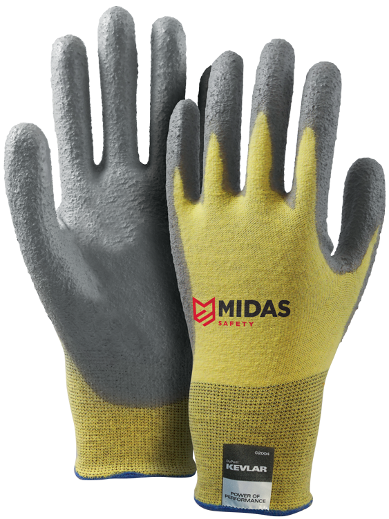
Colour use was also very important in differentiating the sections from each other. The choices were largely arbitrary, but it was important to be consistent. So, over time, readers of the catalogue, and this includes Midas sales staff, could associate a section colour with the glove in question, which would help them find it in a pinch – “NeoTech? That’s a Dipped Cut and Sewn glove… green section”.
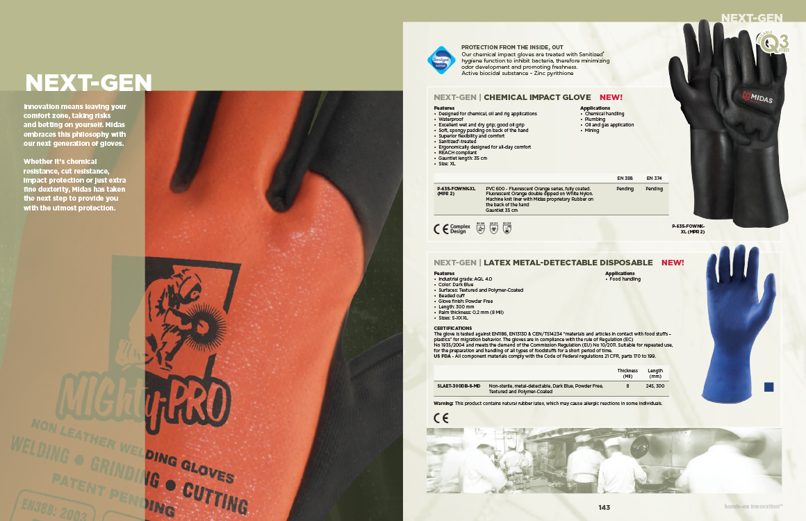
Colour principles apply even to the section opening pages – the gloves are left in their original colour, and everything else – background and model wearing the gloves – get rendered down to a duotone of black and the section colour. All about making sure that the gloves pop off the page as much as possible. Next-Gen (name nicked from the Sony/Microsoft console wars) was a bit of an odd duck out there – they were all new gloves so we didn’t have action shots readily available. So we just went with a close up of one of the new highlights.
TELLING STORIES – ACTION SHOTS and STOCK PHOTOS
We had a lot of gaps between the gloves. Some were just happenstance – when grouping them together by type, they didn’t always just fall into nice divisions. Sometimes I pushed to get extra pages added to the catalogue to include photos. To me it was important that this not just be a collection of gloves, with no visual context to them. We had a quality selection of action shots already taken prior to my arrival at Midas, so I had a nice set of assets to pull from.
I went with a mix of action shots and environmental shots, purchased from stock photo sites. Both were rendered down to duotone, but the environmental shots I backed off a bit in intensity. It gave a bit of a visual hierarchy to the pages – gloves > action shot with glove > environmental shot with no glove. We ended up with a nice variety of environmental and action shots, which gave the reader a real visual idea of how and where these gloves could be used.
You’ll also notice that that I’ve got blurred and lightened environmental shots as the backgrounds. They’re just identifiable enough to give a vibe to the page, but not so clear so as to fight with the copy in the glove descriptions, which I also gave a bit of a hierarchy to by sitting them on semitransparent white blocks.
They took a while to balance out, but it was important to make the pages dynamic without being distracting.
One thing I tried to make work, less successfully, were to have little “stories”. Not quite testimonials, but large photos of people using the gloves, in full body shots, with little quotes beside them. Showing actual people is important – I didn’t want just a big collection of disembodied hands. Unfortunately, I was new, and my grasp of the market was shallow enough that the little quotes didn’t quite work; plus, it was a hard sell using sometimes two-thirds of a page for a stock photo. We did keep a couple of them though – I did away with the quotes and just let the shots speak for themselves.
COVER and BACK COVER
Your opening and closing statement. I went through our selection of action shots and found what I thought were the absolutely best representation of safety gloves in action. Of course, there are so many kinds and applications, but I went with two sets of the coated seamless types – the current industry standards in hand protection – using tools, showing the dexterity and comfort that Midas gloves have to offer…

Add to that a selection of environmental stock photos that run the gamut of what Midas gloves can be used for, and you’ve got the covers of the catalogue.
It should be noted that Midas Safety Inc. is a private-label manufacturer. You won’t find actual gloves with the Midas Safety logo on them. We make them for distributors, who will brand them with their own. More details can be found on that, for the interested, at the official site (which currently still has the old branding).
I’m sure I could go on… there are hundreds of decisions that go into the development of a product catalogue like this. But, these were some of the big ones I made that helped shape the catalogue visually, and I’m quite proud of the end results…
—
The catalogue would, over time, be adapted into a huge number of product sheets that the sales staff can hand out to customers and prospectives. I do a rundown on the thought processes that went into that process here.