Midas Product Sheets vs Catalogue – One, but not the same
While I was hired at Midas specifically to develop their new catalogue, my responsibilities weren’t limited to that. Indeed, I very early on identified Midas’ product sheet collection as an area of great need – they had a number of older sheets that were thrown together in Microsoft Word, and with the new catalogue in development, they certainly didn’t line up with the look.
CATALOGUE AS STARTING POINT
The product sheets and the catalogue both have different applications, so their form had to reflect that. The sheets wouldn’t simply be a matter of “rip a page from the catalogue”. They’d have to look like they belonged with the catalogue stylewise, as a set, but not a slavish reproduction of the book.
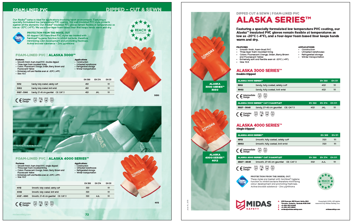
The first order of business was deciding what elements of the catalogue would stay, and which would go. The background was the first to get jettisoned – since these were going to be output locally, as needed, I didn’t want awkward backgrounds or white edges. I didn’t lose the images altogether, and in fact I made the images much stronger, visually. I gave them their own column on the left, over top which the gloves would sit.
In the catalogue, there was generally one glove photo set, per glove entry, and sometimes two or three entries on any given page. Since the product sheets were going to be more or less one entry per page, that freed me up to provide more than one image of the glove in question.
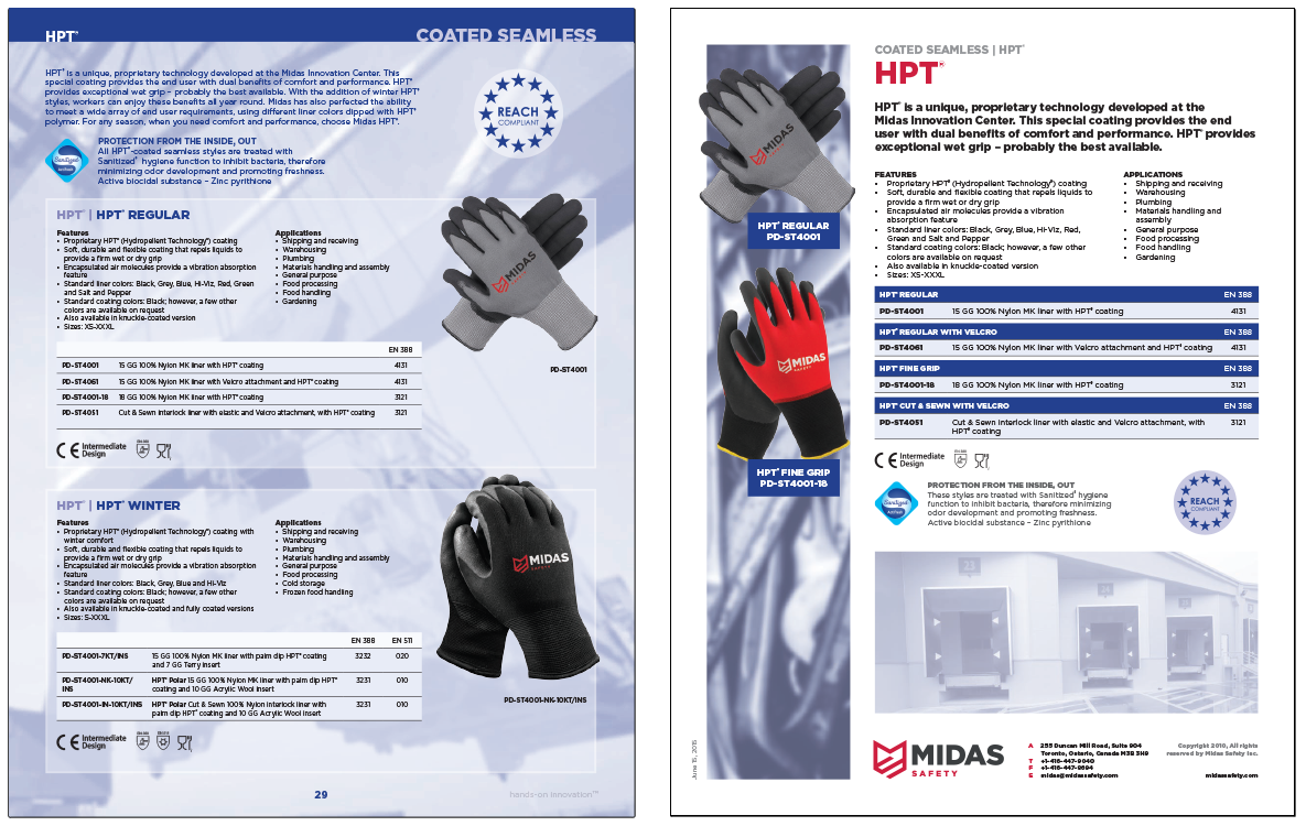
Other elements would be handled differently as well – the glove or series type would be presented in a larger red font. There’s a different flow in the catalogue than on a product sheet – in the catalogue, they have to work together on a page, neither glove fighting too hard for visual dominance over the other. On the product sheet, though, it’s far more important to let the name stand out. These are one-shots, after all, and they have to be easily distinguished from one another if you have a bunch of them in a pile.
There was room for more of a marketing blurb for the glove in question as well, so every glove got one. I’d largely draw from the shell type and coating type to write the copy, but sometimes individual gloves had sales copy already written on the earlier product sheets. In those cases, I adapted, edited and (hopefully) improved.
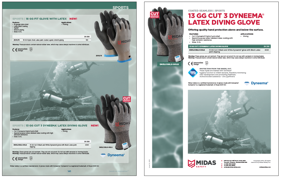
Other elements required adaptive treatment – like the tables. I used white headers and lighter backgrounds for the bodies in the catalogue, but they were getting lost on the white background of the product sheets. So, I ended up giving them the opposite treatment for the sheets – blue headers, to make each one stand out a little more. The table backgrounds are otherwise the same though – they simply look a little darker on the white pages.
There was generally room for an environmental stock photo, showing one location where the glove could be used. These I lightened greatly, similar to the approach taken for the environmental shots in the catalogue. I didn’t want the stock shots dominating the pages too much.
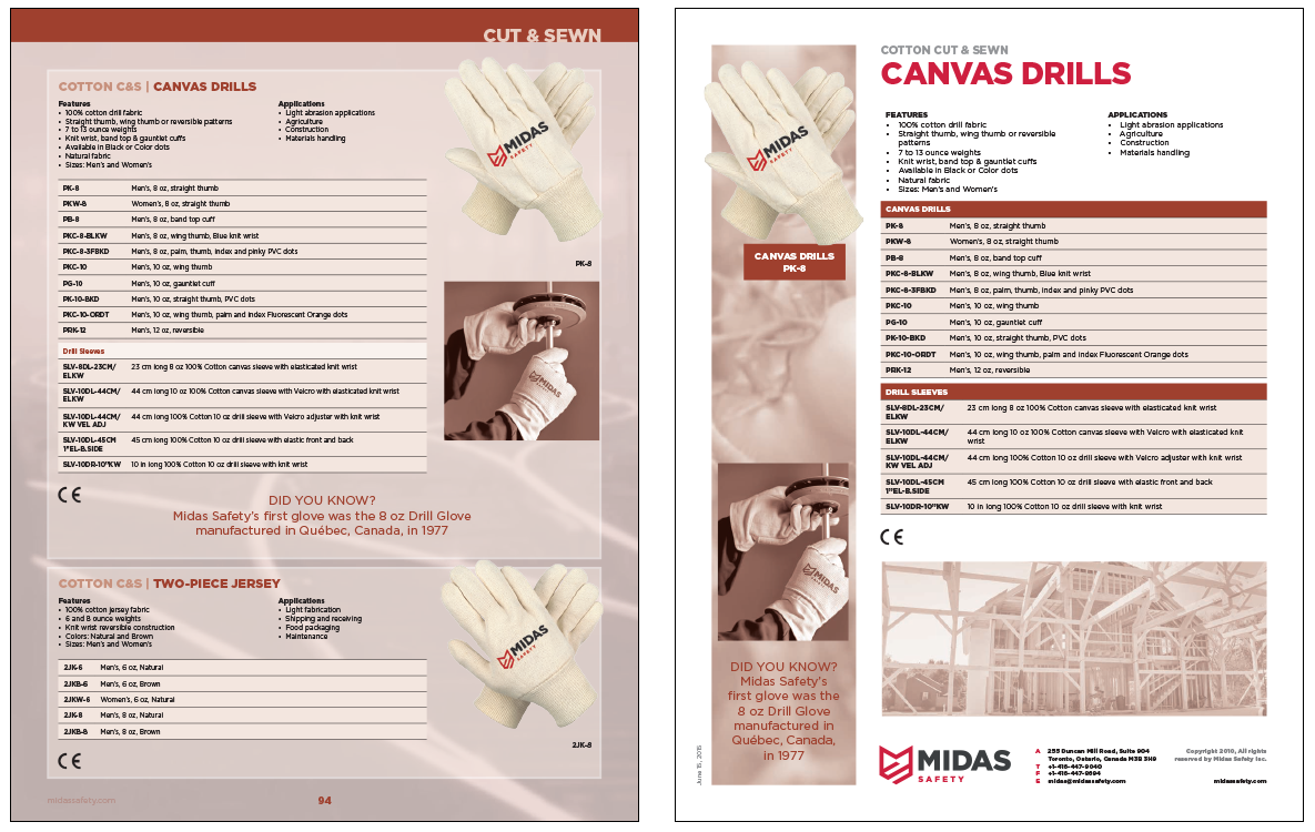
And finally, since every product sheet was going to conceivably be sent out independently of the catalogue, it was important that the company logo and contact info was available on each sheet. On product sheets of two or more pages, that logo and info would be either on the first, second or later page, depending on where I had space to fit. But, it would be there, one place or the other.
COLOURS
I kept the product sheet colours lined up with the catalogues, depending on which category they belonged to. It was important to establish a synergy between the catalogue and product sheets, and to capitalize on the “visual real estate equity” that the colour coding in the catalogue had established.
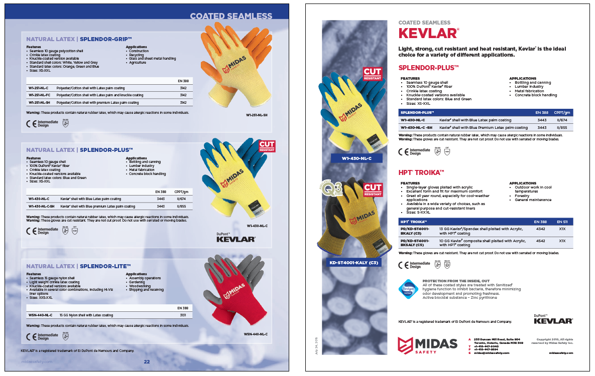
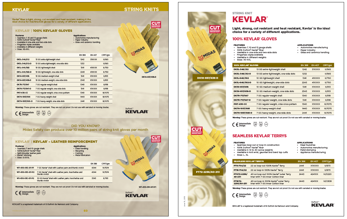
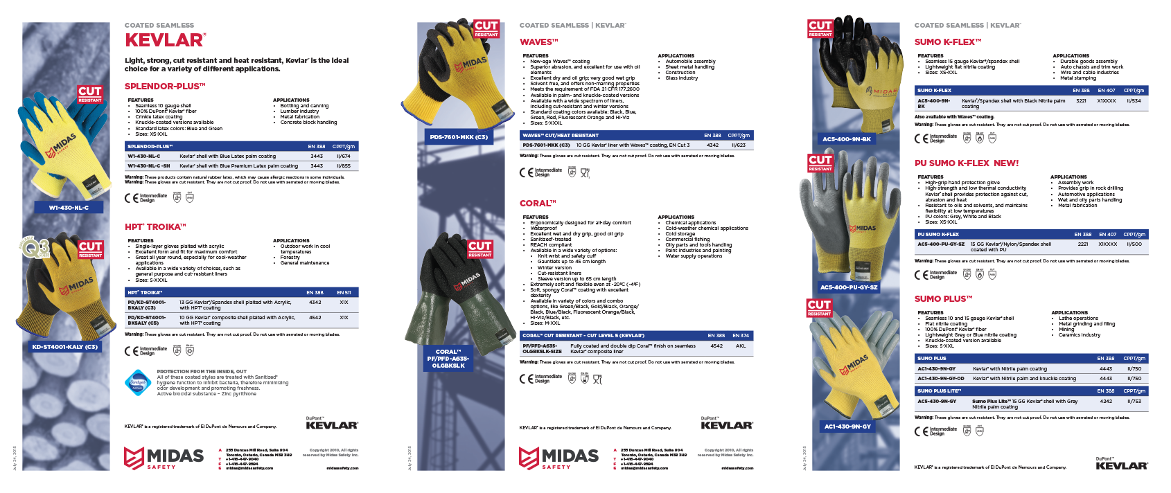
There are more than the four sections shown here, but what’s here is representative. In some cases, gloves like Kevlar® belonged in both the Coated Seamless section (if they were dipped) or in the String Knits section (if they weren’t). They existed thusly in the catalogue, and so I also gave them different section colours as product sheets.
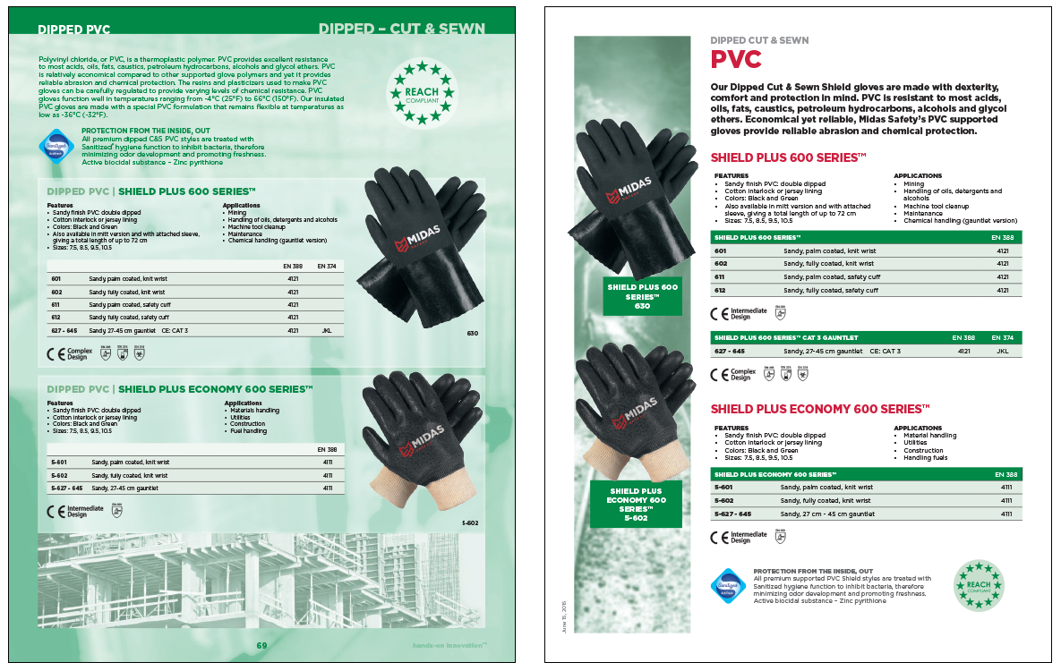
In some cases, like the green PVC, the extra space allowed me to split the tables up, regular gloves from the more protective gauntlet gloves. They were all bunched together in the catalogue, but I could give each type, and their respective regulatory information, their own sub-table.
GLOVES VS SERIES, SINGLE VS MULTIPLE
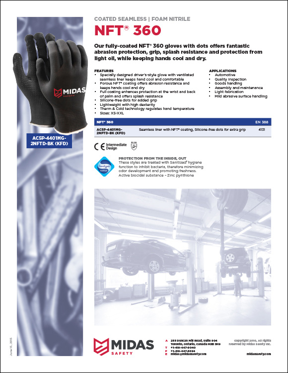
Another set of choices I had was how to present gloves that clearly belonged together as a larger set, versus gloves that stood alone. The NFT® 360 is a loner – it’s there on the page all by itself. Lots of extra space due to the lack of information available to fill up the page. It gets a nice sized environmental stock shot to fill up the space thus created.
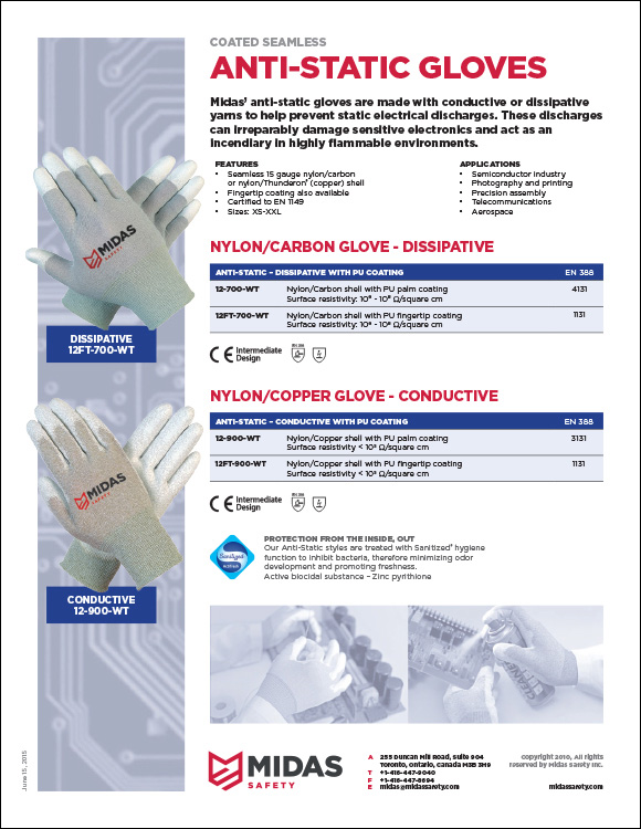
The Anti-Static Gloves, on the other hand, are two gloves that belong together by virtue of being anti-static, but since one is carbon-based (dissipative) and the other copper (conductive) they were put together under a common title, but each given their own sub-title. They had exactly the same features and applications, so those were applied to the general grouping, and only the tables and regulatory codes specific to each glove applied to the subgrouping.
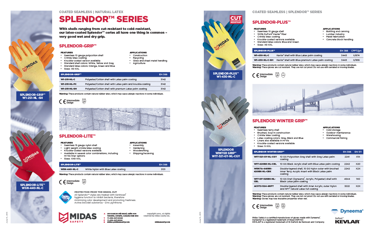
The opposite approach was taken for the Splendor™ Series. They were grouped together by series, but as each glove was different enough from the other, the features and applications weren’t shared, but instead applied to each glove.
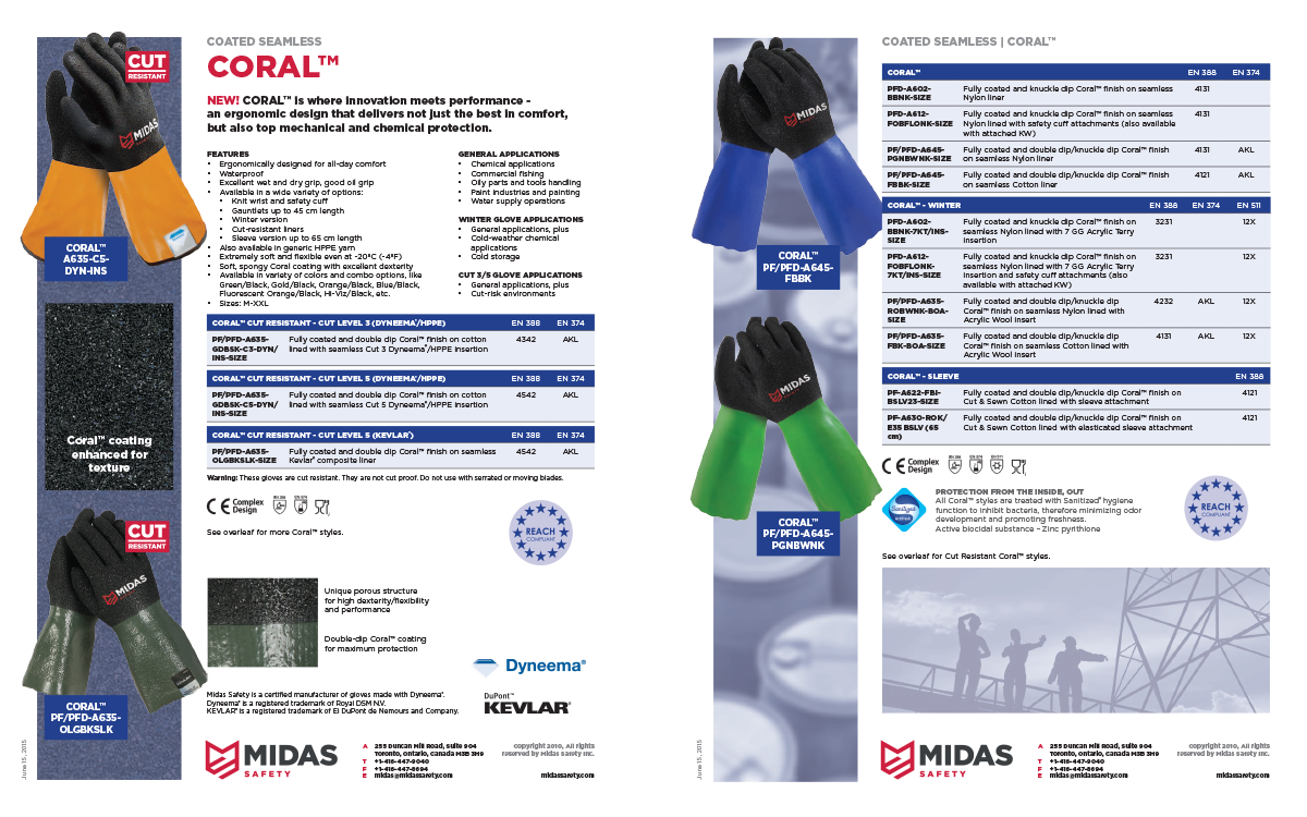
There are a great variety to the Coral™ gloves, but they all have the same set of features, and applications are broken down by type. This one came close to breaking the paradigm, and I had to just sort of seat-of-the-pants it.
And then, again, back to Kevlar®. This set wasn’t designed as a series, per se, but rather just a collection of all the Kevlar® gloves available (in this case, of the Coated Seamless variety – the String Knit Kevlar® had their own separate bundle).
—
Some gloves only exist as product sheets as part of a larger collection, but my workflow is pretty nimble. With enough lead time, a colleague could easily say “Hey Geoff, could we get the Splendor™ Winter Grip all by itself?”… and it’d be easy enough just to take the series set and strip away everything I don’t need to give the sales staff what they do need.
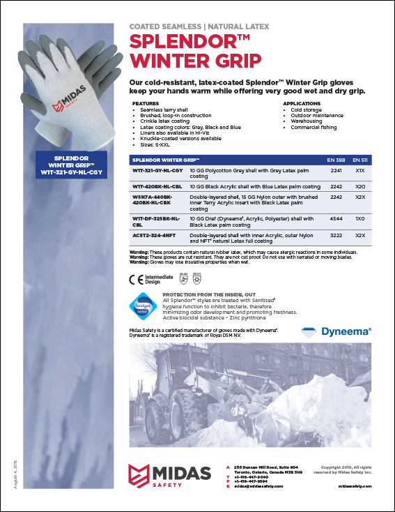
There. Splendor™ Winter Grip, all by itself.
Took about twenty minutes.
All in all, it’s a pretty big ongoing project. Much of it is rote – you create enough product sheets, and they’re not all that exciting. On the other hand, there is no absolute paradigm for how the gloves exist and what data is attached to them. Thusly, I don’t usually have a hard-and-fast rule on how a product sheet should be created for any given glove – it depends on the use and needs of the sales staff involved, which means that I’m largely making it up as I go… while keeping it consistent with everything I’ve done thus far.
As with anything, it’s all about keeping that balance.
2 Comments
Join the discussion and tell us your opinion.
For fear of repeating my self; I have always liked your work. The work as it stands and adding the new applications you learn. Magnificent!
Thanks Jen. Much appreciated. 🙂