A Look at The Walking Dead’s Season Key Art
<preamble>
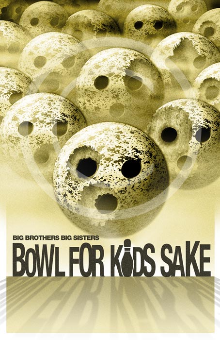
I didn’t discover The Walking Dead until it was into its second season. I’d heard about it, and I’d stumbled upon the first season DVD set at Christmas in 2011. It was only a few months later that I would develop the Zombie bowling theme for my collection of Big Brothers Big Sisters Bowl For Kids Sake themes – I was certainly using the first two seasons as inspiration for it…
Certainly I could have hewn a little closer to the sickly green hue, but it was intended to homage, not rip off.
In the summer of 2012, I would start developing some posters of my own for my Atlantic project. There were three main ones:


I actually didn’t have The Walking Dead in mind at all when I developed these. What I did have in mind when I started was the idea that I didn’t want to create a bunch of “floating heads” posters. Not because they couldn’t have been cool, but because there would have been nothing for people to relate to, with these floating heads. In movies, you’ve at least got recognizable actors, or in some cases, beloved characters, that mean something to the general public. What would I have? Fish? Cass? Willy? Ramirez? Nobody’d know or care who these floating heads were.
So, I opened with the atmospheric “Secrets” poster, with the temple in the hill under the water. Moody, hopefully intriguing… it hints at the story, of something submerged, that wasn’t always. The second, the “character” poster, does feature the characters, but they’re in action to some degree, bracing themselves for some onrushing threat. And with the fiery wreckage and menacing floating head behind them, a sense of the threat they’re facing. And then, “Temple Hill”, showing the previously submerged “Temple” now towering over a lone character, the guy from the second poster. The three posters work together to tell a bit of a story, but not too much of one.
</preamble>
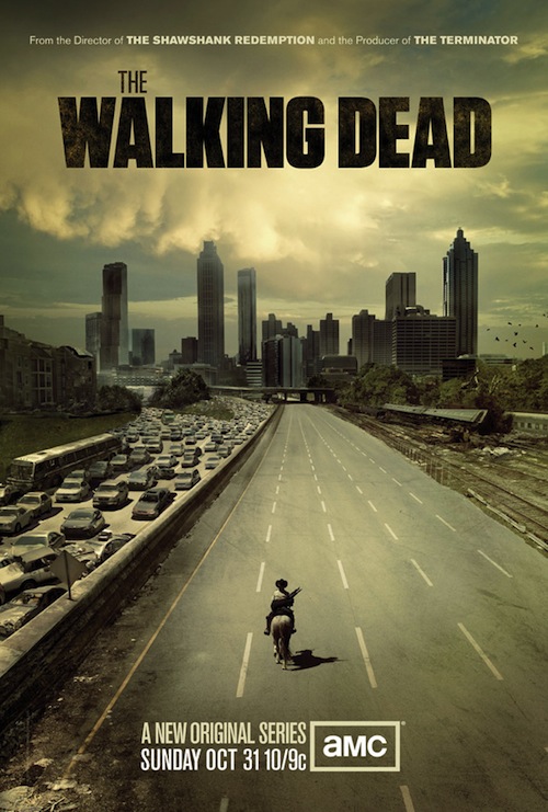
The Walking Dead season one opened with an awesome poster, didn’t it?
One guy on a horse, venturing into an abandoned city that clearly people have died trying to escape from. Fans of the comic would know he’s Rick Grimes, but to the uninitiated, the name would mean nothing.
So what they’re selling here with the season one key art is the concept. The name “Walking Dead” screams zombies. The imagery, the colour, everything screams “apocalypse”, “death” and “alone”.
It’s a fantastic image, and to me, the best way to break a new series’ artwork… sell the concept, not the characters.
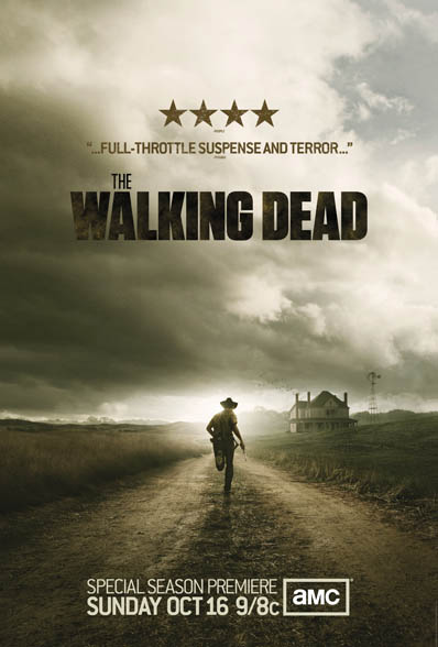
Season two’s art continues in the same vein. The same bleak and grim colour scheme, again, a lone character running along a deserted road. Fans of the property would know that the season’s going to feature the farm, but to the uninitiated, it’s just a farmhouse in the distance. But even when I didn’t know anything about the farm, I felt the appropriate dread at the poster, just imagining what kind of zombie, er, walker horde the guy’s running from.
So, like the first season, the second season’s key art focuses on the concept of this lonely, empty, post-apocalyptic world, and not so much the characters populating it. You’d think the marketing crew were still not ready to take for granted that the general public would know or care who this show is about.
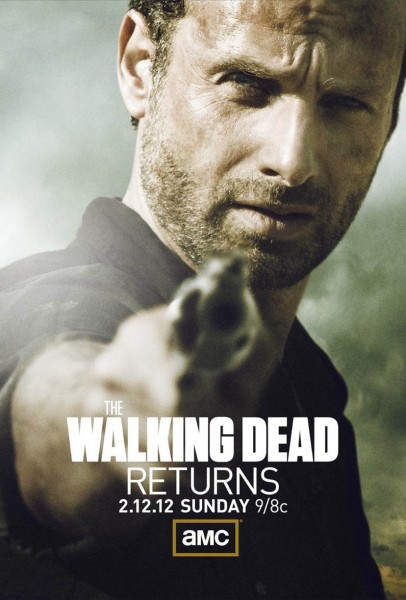
Although I have to say, they’ve made a bit of a left turn here and pushed Rick front and center. With the “Returns” on the poster, though, it’s clear that this is aimed at the already converted… the ones who are itching for the second half of the season, not the ones who’ve tuned in already.
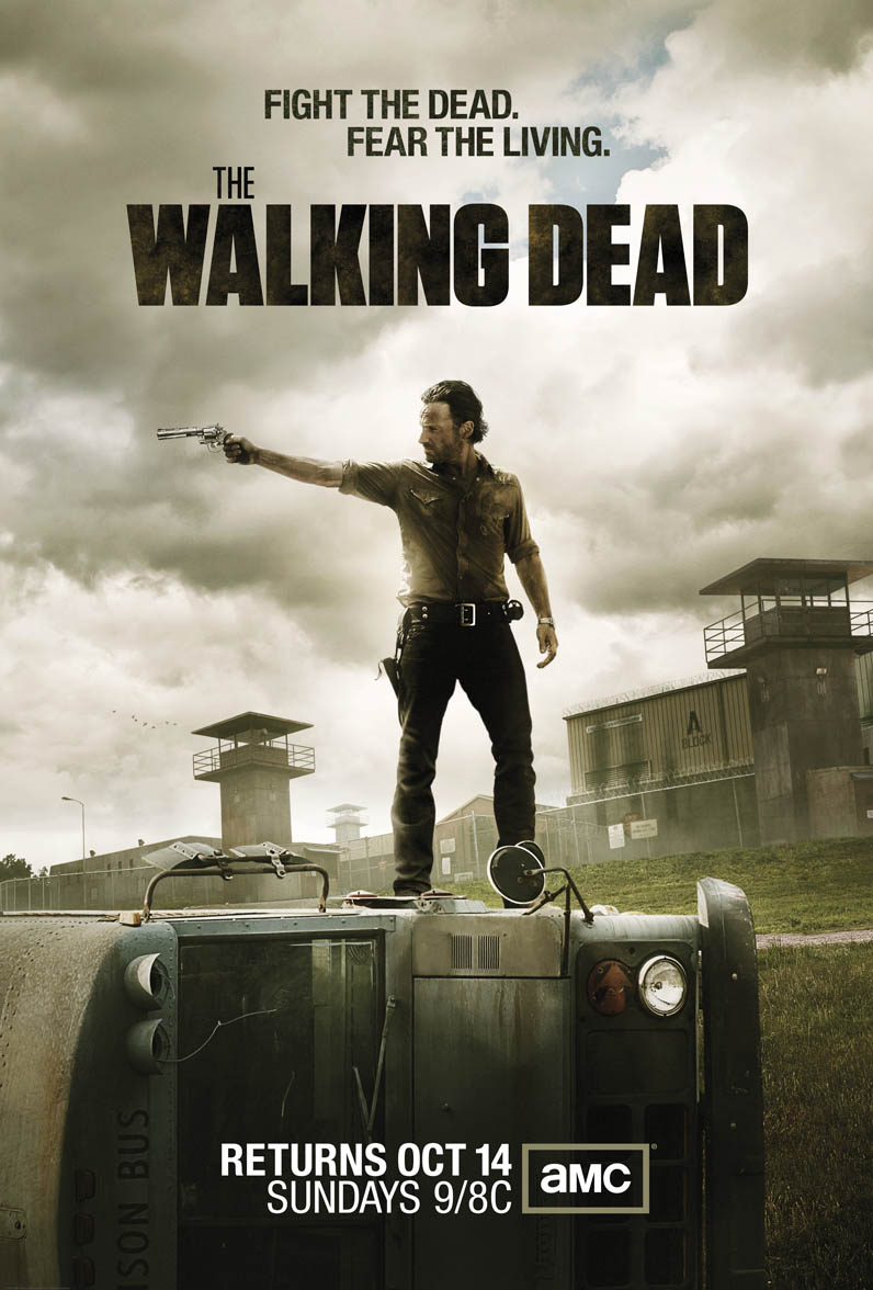
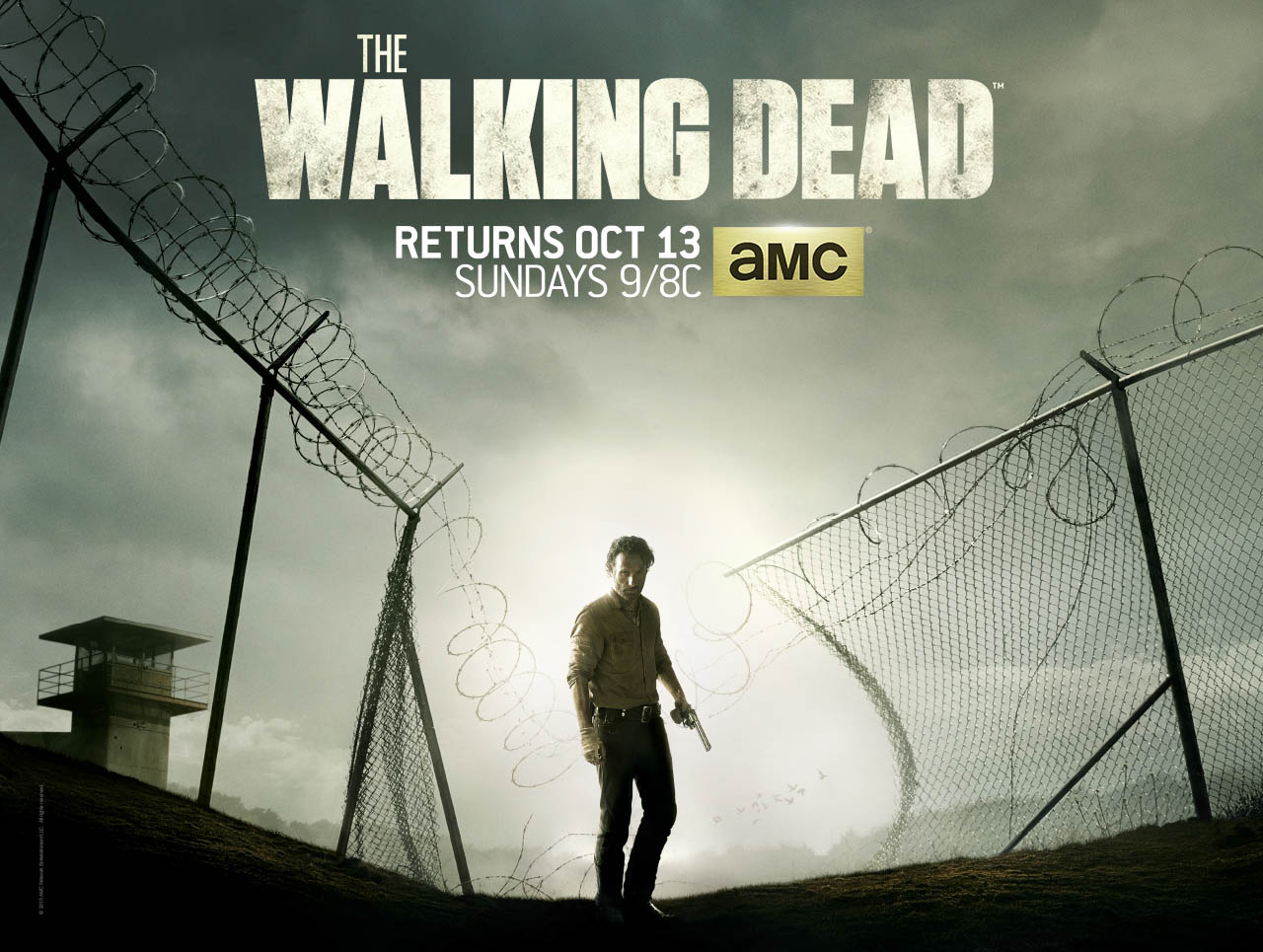
Now, notice the change in main season art at season three. Rick again, same as the first two season posters (sans hat), but he’s now much closer to the forefront. They’re still pushing the concept – that this season’s going to be about the prison – but now they’re clearly more comfortable with the idea that the general public has some familiarity with the characters, and that it’s time to start pushing them to the fore.
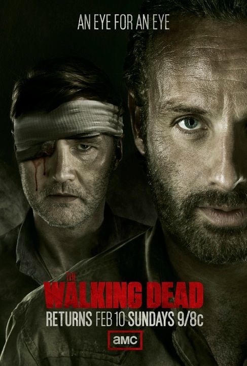
They continue breaking the seasons down into half-season arcs. Personally, I missed the more evocative environmental art that marked the first three season intros, but this is pretty cool too. And it’s all about the characters and the conflicts between them. They’re not even trying to sell you on the concept now… you’re either on board and know who the Governor and Rick are, or you don’t care and they’re not trying to sell you on it anymore.
And yet, here we are again for season four. Still at the prison, but they’re selling us a concept again… something’s broken through. But even though Rick’s physically smaller than the season three opener, the focus is still totally on him. So we’re seeing an uneasy amalgam of concept and character here. But it’s not aimed at the uninitiated…
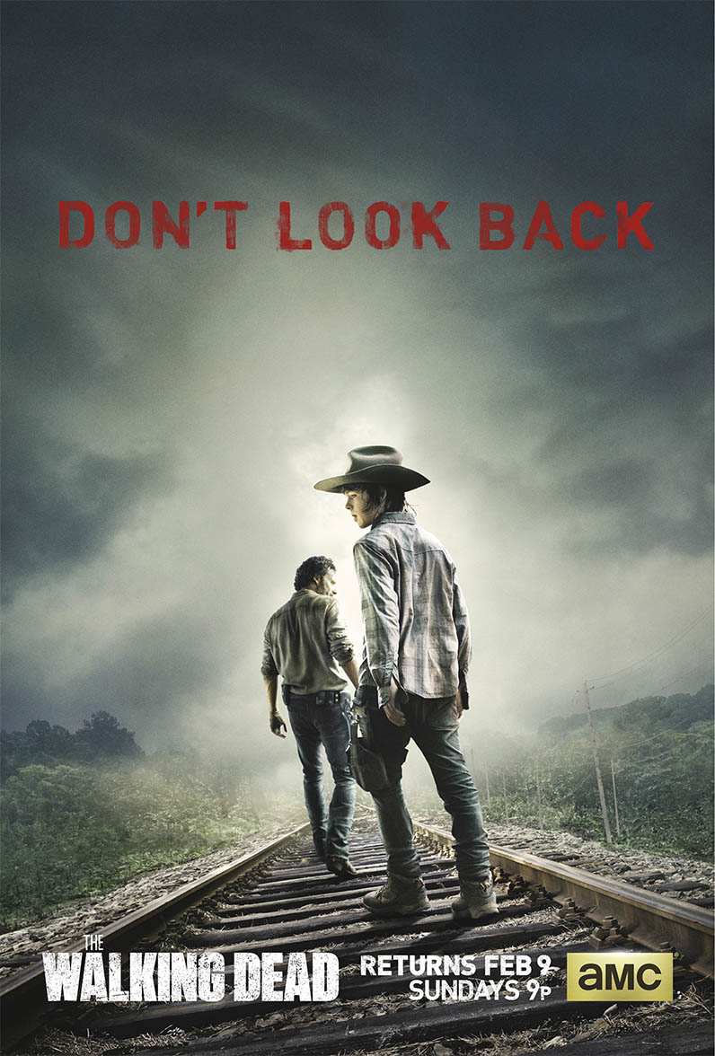
And now they’re on the road again. The key art shows, for the first time since season two, our characters on the run. No home. No base. The colour palette’s opening up, with the red returning, and the muted greens of the forest. But they’re certainly not comforting greens and bespeak a dreadful exile and painful departure. Again, a really effective mix of characters and concept, one that a maturing series clearly feels it can afford.
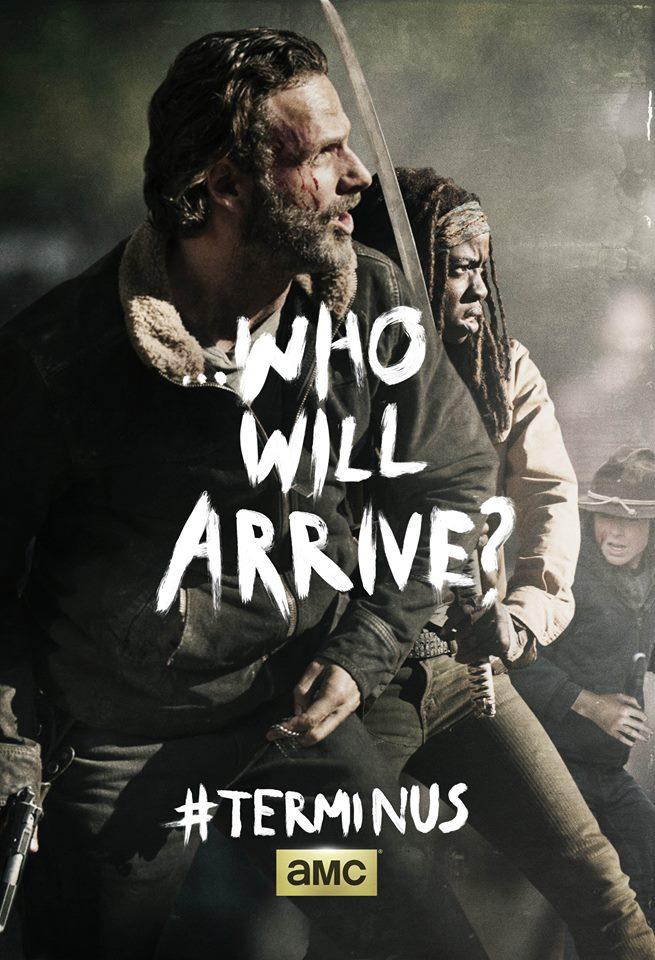
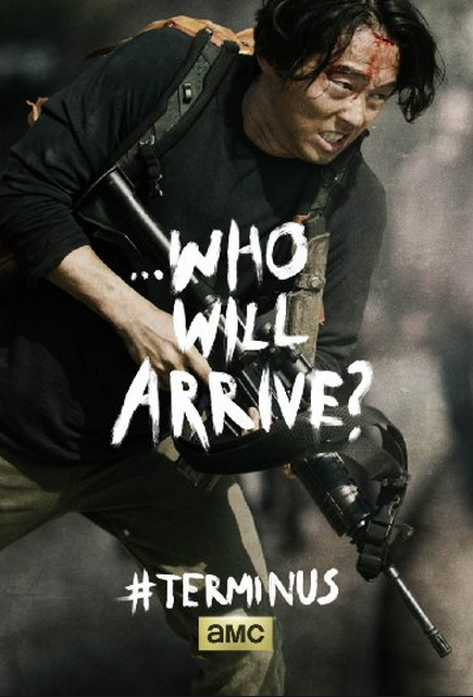
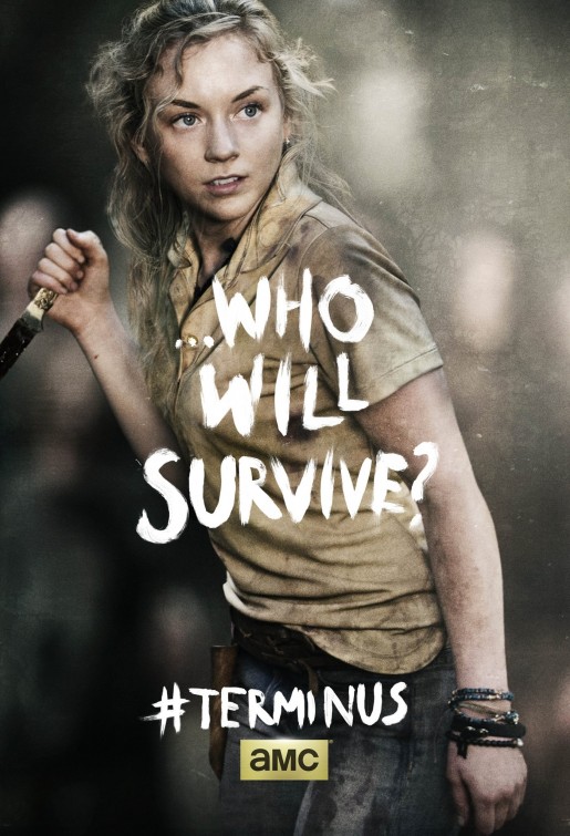
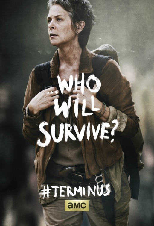
They did an interesting little blitz leading up to the season four finale. Terminus. Who will arrive? Who will survive? Although the journey there ended up being a little anti-climactic, as there were no major casualties on the way (“just look at the flowers” notwithstanding), they sure ended the fourth season on a cliffhanger.
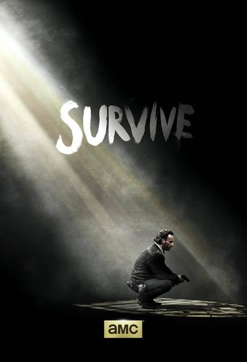
This season five artwork showed up shortly after season four ended on a cliffhanger. Moody. Lonely. And without even “The Walking Dead” plastered on it… this is clearly a show that knows it has its audience and doesn’t need to sell them on the concept anymore. Even as small as Rick is, this is a character poster. And note the continuation of the handpainted “Survive” from the finale posters.
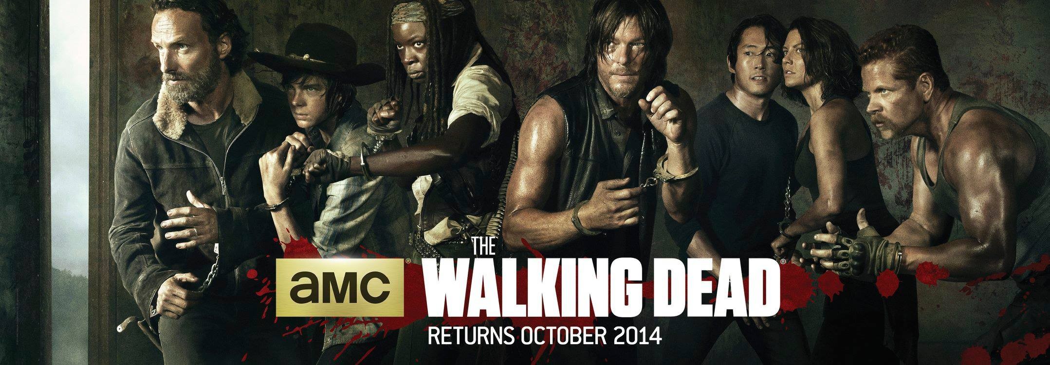
Comic Con in 2014 saw a pretty cool advert for season five. Our batch of survivors in the train car where we left them in April, handcuffed, no weapons but ready to fight. Defiant, to the last… though it seems pretty hopeless. Wonder why Carol’s not in the poster?
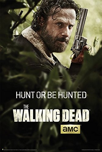
This is a huge shift in the branding of the show. There’s still a sickliness to the tone, but it’s moving away from the yellow, into much more of a green. And check out how big Rick is compared to the earlier posters. Not really selling concept anymore at all (though I suppose teasing that they will be walking through the forest)… they’ve gone full-on character here.
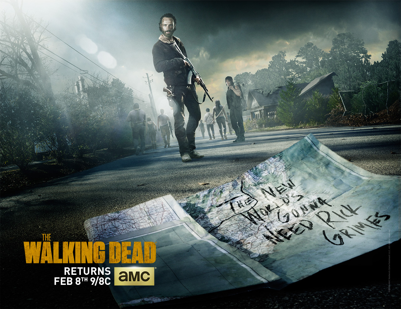
And the back half of season five. On the road, again, but pushing Rick in ways that earlier posters hadn’t. Certainly writing his name on the map is a new step.
Which leads us to this…
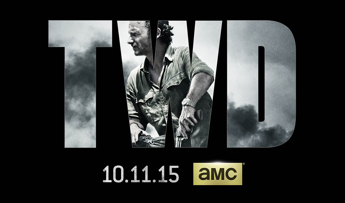
Now, this is a show that knows it has its audience. When you don’t even bother putting the show’s name on there, when you just use the acronym that the fans and media use when referring to it… well, that’s a clear sign that you know you’ve got a place in the pop culture pantheon. And why not? Six seasons in (and just renewed for a seventh), this piece brims with the confidence of a show that has no doubts that everyone knows what it is. Once again, focusing on Rick (if they ever kill him off, it’s going to make for a jarring change in key art), and not giving us any idea as to the conflict, other than to know that there is one looming…
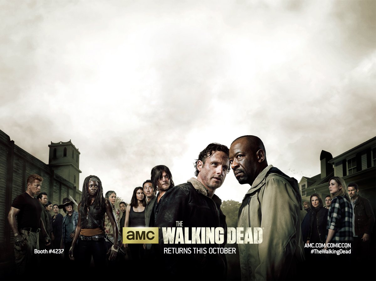
I’m not sure which one’s considered the “main” image. The “TWD” is the one that shows up on my iTunes Season Pass, though I’ve seen the one around the interwebs too. A bit of concept, with Alexandria looming in the background, but it’s largely a character piece, with Rick and his crew on the left, and the Alexandria crew on the right. It certainly looks like Rick and Morgan are going to be at cross-purposes, which is what the last episode of season five left us anticipating…
And that’s where we’re at for now. I’m sure we’ll see a poster for the back-half of season six soon. Will it be another “on the road” poster like the “Don’t look back” and “Rick Grimes map” posters? I guess it all depends on whether or not Alexandria survives the first half of the sixth season.
Now… interestingly enough, there’s a new Walking Dead series out there. Can you guess which approach they took for their first batch of posters?
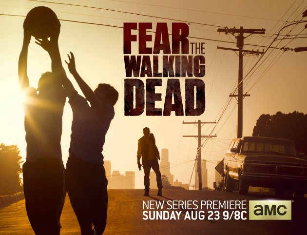
Right back to the conceptual art. No characters that we don’t recognize… just selling us on the concept, which is best exemplified by the second poster. Blithely playing hoops in the street while the zombie apocalypse creeps towards us…
Must give kudos where they’re due. From what I can gather, The Walking Dead main season material is done by The Refinery, with Empire Design picking up some of the midseason stuff. The Refinery did the “basketball” FTWD poster, with Cold Open delivering the “beach” one.
All in all, some pretty impressive stuff here. Can’t say I didn’t enjoy gathering up all these resources…
http://www.impawards.com/tv/walking_dead_gallery.html
http://www.impawards.com/designers/refinery.html
http://www.impawards.com/designers/empire_design.html
http://www.impawards.com/tv/fear_the_walking_dead_ver2.html