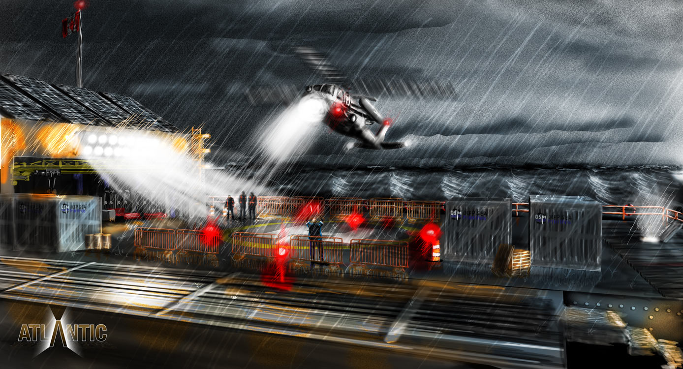
Branding “Atlantic”
![]()
Before even starting the graphic novel, there is still so much prep work to be done. You’ve already had the opportunity to see some of the concept art as it’s developed. Well, now it’s time to think about the in-world design of “DSM Deep Sea Mining”. I threw the logo on the Lilypad pics a few weeks back, but that was all I’d done.
So, the logo… and the spiel as to the ‘why’…
Black and blue, very strong, bold colours. Blue symbolizing the water, black the ore they mine. In a circle, symbolizing “all over the world”, with the DSM floating on the water, symbolizing the floating platforms, and the “M” reaching down into the water, into the ground below.
The font use sprung from my use of Impact for the “DSM-04” call letters plastered all over The Lilypad. It had a nice industrial boldness to it, but Impact as a font doesn’t have a lot of variability to it, so I switched out to the Helvetica Neue condensed family instead. Same feel, but with more potential uses for it.
You want the world to feel as real as possible, and when the story takes place on a commercially owned floating platform, populated by characters who work for that company, you realize that you’re going to have to define the look of the company and the uniforms they wear.
So far, you’ve seen Fish in a fairly innocuous dark pants, grey long-sleeve top. I realized it was time to decide what his outfit was actually going to look like. DSM would supply clothing to wear, most likely thermal clothing designed for being out on the Atlantic. So, before Cassandra shows up, he’d likely be in regulation clothes. Once she shows up, would he actually wear his own clothes, or stick with the DSM materials? In any event, I covered a whole range of potential clothes that Fish might be wearing, and would also be seen on other Lilypad crewmen during the story.

Taking a cue from the logo, black, blue and white. Although grey felt more appropriate in an industrial environment than white. Really, what clothes would stay white anyways? I explored selective applications of the horizontal bands of the logo, and a vertical thrust as well, with a tasteful application of the DSM logo on the chest and shoulder. In one of the concept art pieces, I introduced characters wearing reflective vests, so why not? Plus, in the script, when Jacques first appears, I say he’s wearing a jacket. So, need a jacket as well. And Fish’s diving suit… it just goes on (and this is just Fish… Willy wears overalls…) and on. 🙂
Of course, those are just the clothes. I wanted to start thinking globally. How would DSM be branding the rest of their stuff? I’d already presented the crates in the previous concept art, but now’s the time to actually get down and decide what they’d look like, especially since Fish’s “lost crate” would make an appearance somewhere down the line in the story.
So, taking a another cue from the logo and clothes, I looked again at horizontal layers, though I dropped the black as a colour. Black looks good as a grounding element in a logo, but applied widescale, like, say on a crate or helicopter, it tends to turn the shape into an eye-sucking blob. Not what I wanted. So I settled on blue, grey and white, horizontal layers, with the occasional vertical dip to reflect the “M” reaching down into the ocean floor in the logo.

So, now the world really starts to come alive. Next up, I think I’ll apply the horizontal colour strips to The Lilypad itself. Maybe the characters will refer to the varying layers of the platform by their colour code…

Pretty cool for something that just started as an abstract concept when I wrote the script.