Face and Pet Painting
My ongoing relationship with the Executive Director of the Greater Sudbury Big Brothers Big Sisters has resulted in an ongoing partnership supplying marketing efforts for her side business as well.
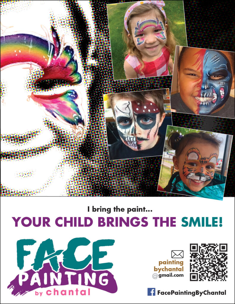
I crafted these headlines myself. I probably wouldn’t have used the term “your treasured pets” on my own, but given the business name, it certainly fit. The face painting headline came second. I wanted something that mirrored the structure of the Pets poster, but no inspiration came for that approach. Instead I started playing with the idea that Chantal’s supplying the painting, but the smile will be coming from the overjoyed child, who gets to be a pirate, a tiger, a butterfly rainbow or something a little more abstract.
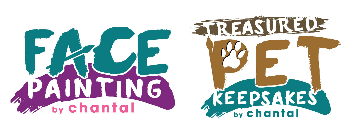
It started with the creation of the Face Painting logo (and its oh-so-subtle paintbrush and child’s face) then included a “sister” logo in Treasured Pet Keepsakes, finding other ways to incorporate the paintbrush as well as a paw print. Normally when I design logos they are far more geometric and corporate in feel. In this case, though, partly because they were less succinct business names and more longer descriptive phrases, a looser feel seemed to work. Something more organic befitting a painter and artist.
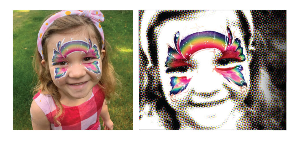
After the logo, I had to create visuals for a tent and flag system. She gave me this adorable picture of her granddaughter, but I didn’t want to use it as it was. Not because it didn’t work, but because it was too specific. As a snapshot, there was clearly an emotional connection to it, but I didn’t think it would stand out as an identifiable marketing image. So, I extracted the painting from the face, and rendered the rest of the image down to that contrasty halftone. This had the effect of taking the little girl away from being a very specific little girl and becoming any little girl – she could easily be your daughter, granddaughter or niece. I had to push the colours into a more psychedelic range… what looked natural on skin looked pretty dull against white.
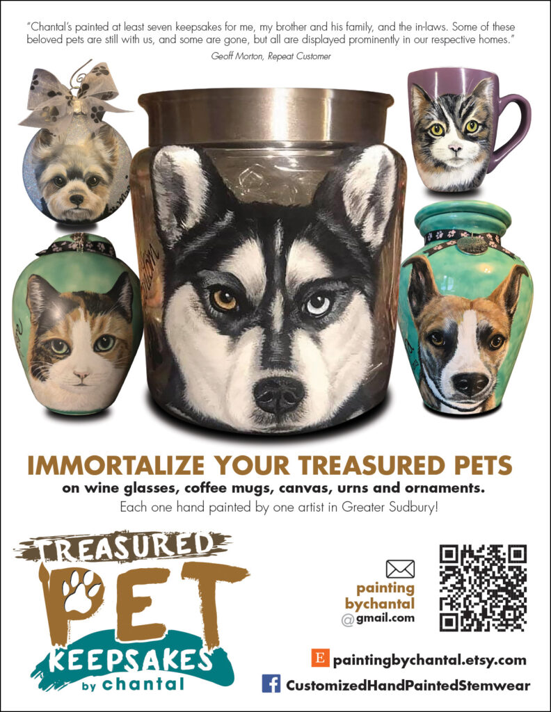
Treasured Pet Keepsakes needed attention next. There was some debate on what to show. She sells more urns, but the glaring dog with the multi-coloured eyes was so striking, and on a sign system would attract more attention from a distance. So, the choice was to use this image instead of the urn. Shutterstock was my friend for the background. It was messy, but told the story we wanted to tell.
The two ads at the top of this post are the latest in the ongoing works, showing up online and the Treasured Pet Keepsakes one having a physical presence on the wall of a local vet… oh, hold on… Pet Keepsakes on the wall at a vet… I just got it.
Duh.
Chantal Gladu, Agency Director, Big Brothers Big Sisters of Greater Sudbury
“Geoff has provided his professional services to Big Brothers Big Sisters of Greater Sudbury since 2002 on various design projects. During this time he has shown exemplary initiative in creating a wide variety of design artwork including logos, posters, banners, greating cards, business cards, advertisements, web graphics, pamphlets and more. His eye for design is first-rate as are his skills in leading design software. Geoff is a team player with a “can-do” attitude. His strong work ethic and ability to quickly complete any job thrown at him has made him an asset to our agency. Geoff is creative, reliable, flexible and personable. I highly recommend Geoff to any employer or individual seeking a talented, motivated graphic designer.”