MARS!
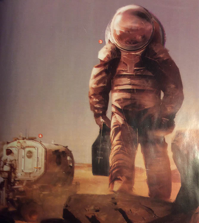
A couple weeks ago I was browsing the newest (at the time) National Geographic in the store, and I stumbled upon a striking image of an astronaut. The issue was Mars, and had been released, I guess, to promote their then-upcoming miniseries (which I’m really enjoying).
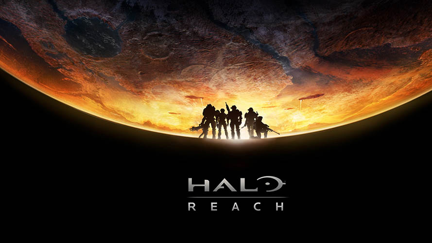
The second I saw it, I realized “Hey, I can do something with this!”. I thought back to a really cool cover image put together for Halo: Reach, and I had a general idea of what I wanted the image to look like. I absolutely loved how they’d used character silhouettes coming up from the “space” at the bottom of the planet, and how the planet itself both looked like a planet, but also a ground’s eye view through a fisheye lens.
So, I started with that general approach, but didn’t slavishly copy it.
It was a start. And hey! The astronaut could make the “A” in “MARS”.
It wasn’t quite working, and I didn’t really like the fact that the planet was off-center in the image, as was necessary because there is no middle letter in “Mars”.
So, I had my starting point, but I knew more exploration was needed.
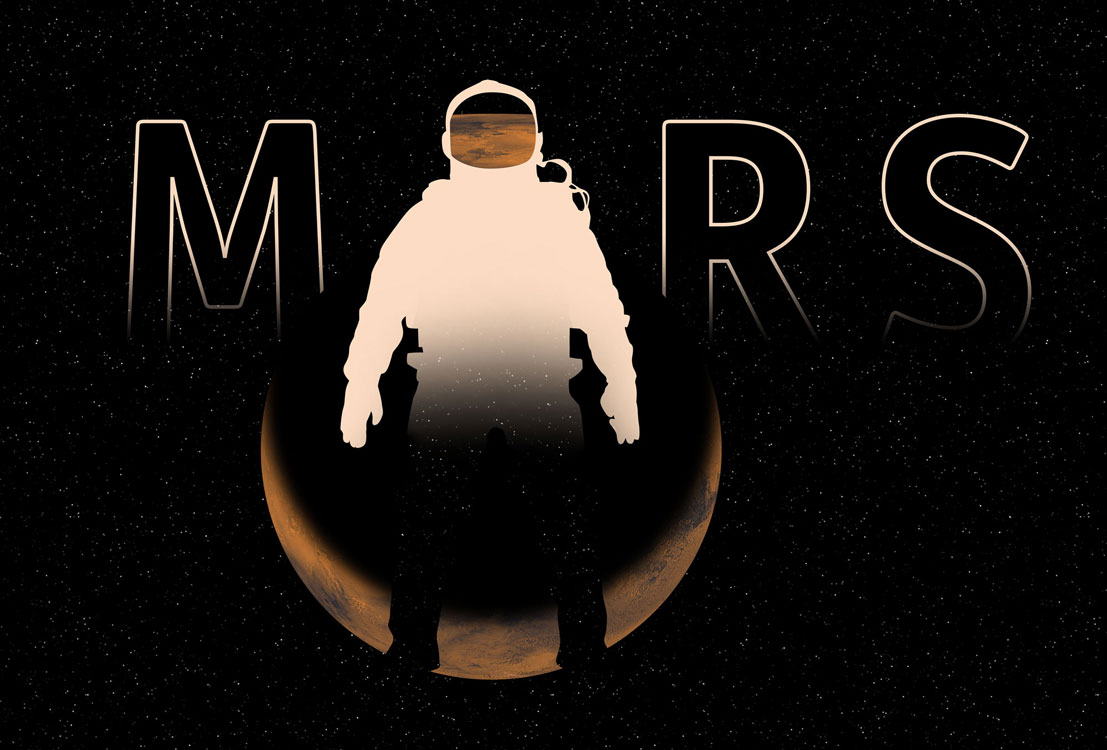
I decided to junk using the astronaut as the “A”. I changed up the font, and re-drew the astronaut himself, much more careful this time, taking care to use a lot of geometric shapes and little details like the circles on the joints where you might find rubber articulation.
I abandoned the silhouette feet… the one element I loved from the Halo: Reach graphic. But, it just wasn’t working. Sometimes those things that get you started on a project just have to fall away. So I rendered the Mars photo down into a more stylized vector piece, and overlaid it on the astronaut’s silhouette. Now it’s starting to take shape.
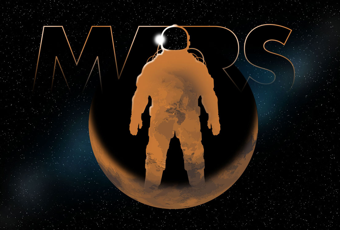
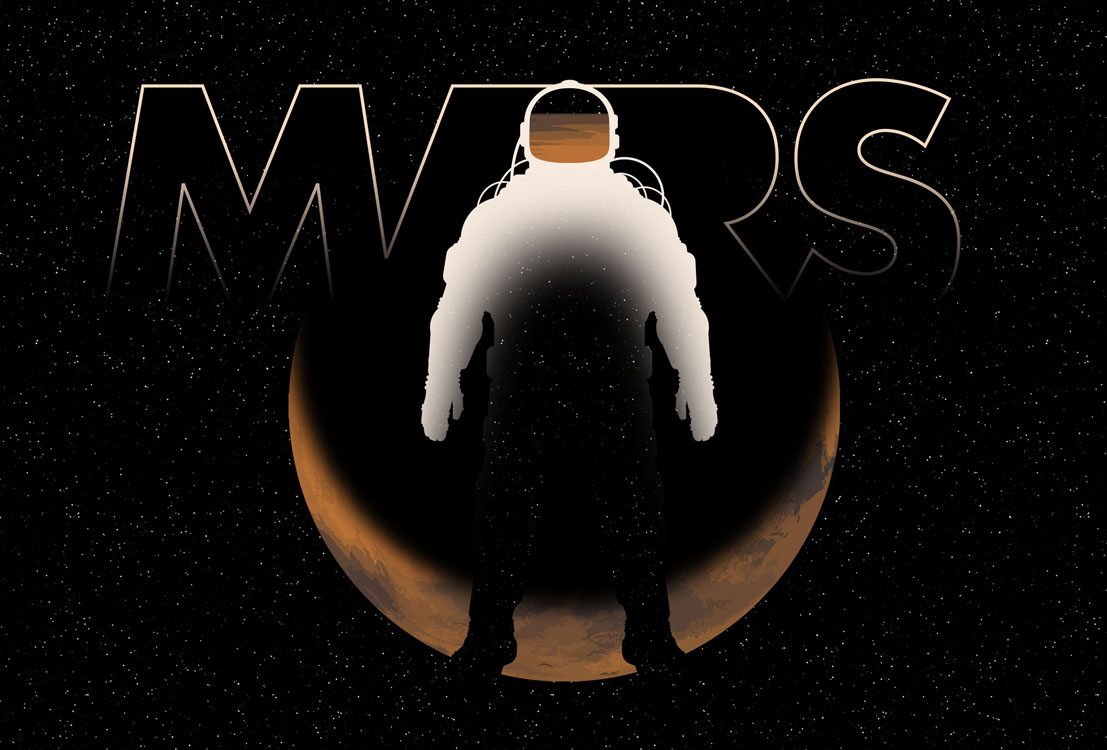
Once I made the astronaut orange, I had to get rid of the Mars reflection in the visor. Once that was gone, I started seeing a nice spotlight on the side of the head. Plus, realizing that silhouetted Mars was getting lost on the spacey background, and wanting to see some contrasting colour in there, I decided to add a “Milky Way”-esque cloud behind the planet. I’d already done a similar thing last year in my Star Wars drawing, and I’d liked how it made the Death Star stand out, so, why not do it again?
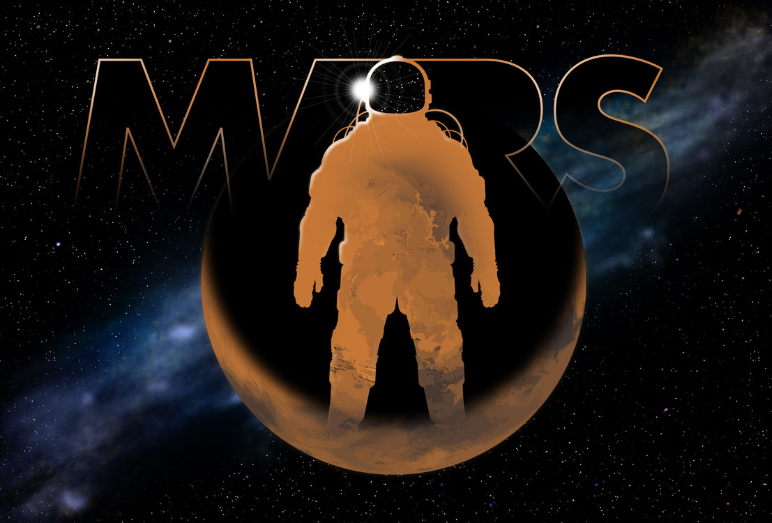
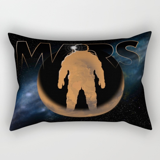
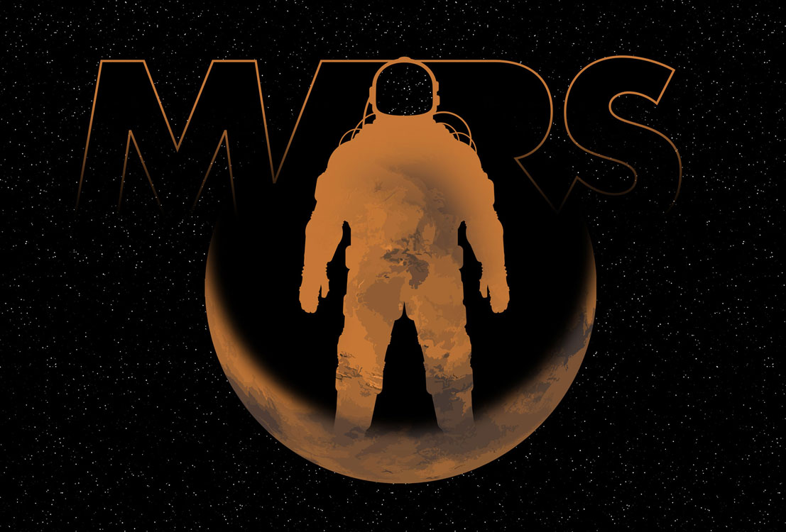
Aaaaand that’s a wrap. Added some to the “Milky Way” behind the planet, and some variety in the stars… but by now, it’s starting to feel laboured and that I’m just making changes for the sake of making changes.
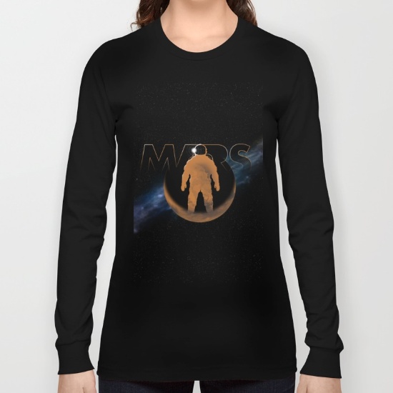
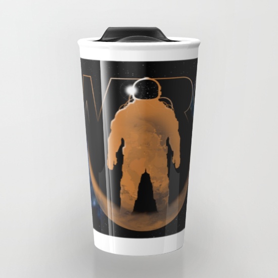
So, I’ve outputted the file in some different sizes and layouts and uploaded them all to Society6. Now, I’ll have to promote them… but that’s for another night. 🙂