The Hub
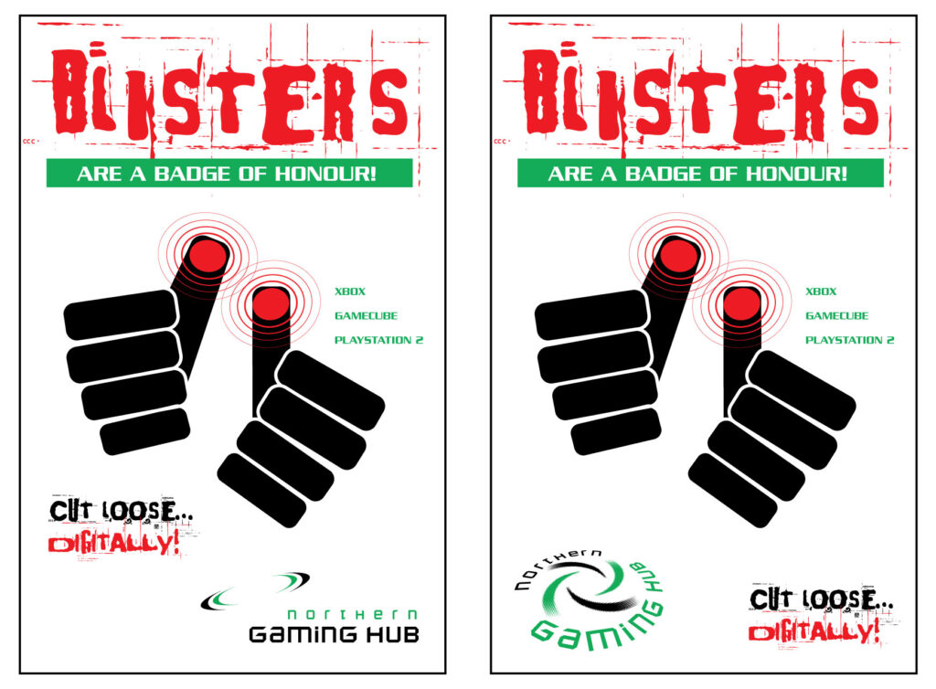
Northern Gaming Hub was a short-lived gaming shop started by a friend of mine in 2003 or so. Started at the cusp of the Xbox Live explosion, it was a passion project that was probably doomed from the outset, given how movie/game rentals were on their way out and his target audience was notorious for not wanting to pay for things. He asked me if I’d develop him some marketing materials for it, including a logo and some posters. Given my longstanding love of gaming, how could I say no?
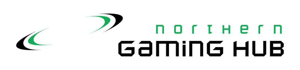
I thought it was cool at the time, and I think there are elements in there that could make a cool logo, if I’d pushed it further. Incorporating them more. The element on the left is obviously the “hub” in Northern Gaming Hub, kind of a swirling singularity around which everything revolves. But, as I’ve come to view in hindsight, it was nowhere near developed enough as an icon to stand alone, and not incorporated enough into the unit to be really cohesive.
So, for this little project, first thing I tried was to revolve the text around it more…
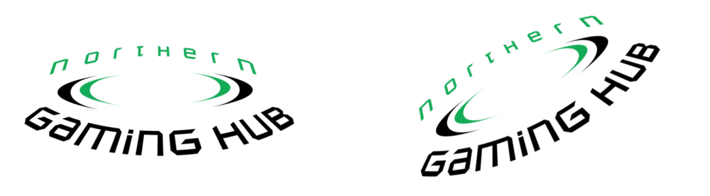
It’s a thought, but honestly, feels more like a band-aid solution than an actual design solution. So, no. Was worth a shot, but let’s look at something else.
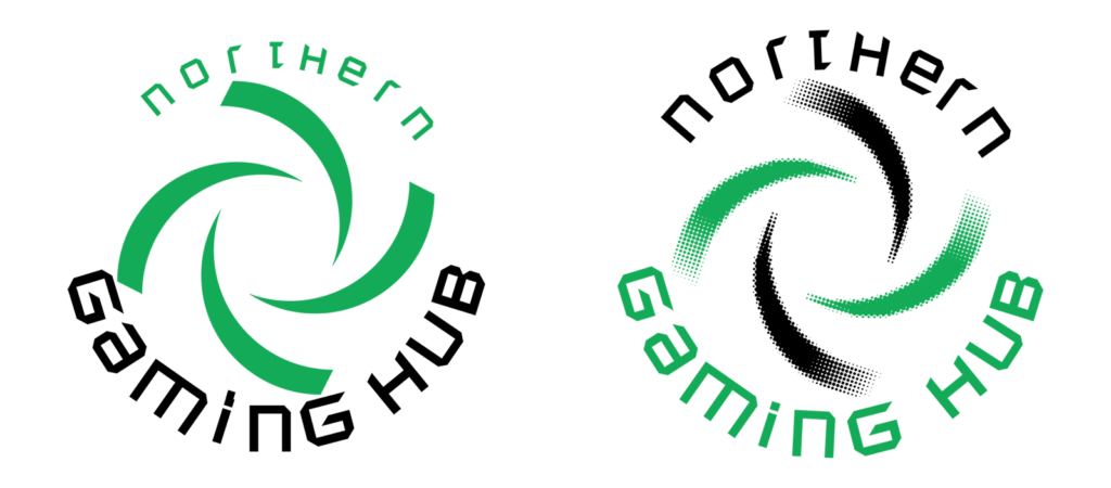
So, retaining the fundamental characters and the work I’d done on Northern Gaming Hub, I just played with taking the rotation lines and exploring the visual idea of rotation around a central point. Now, admittedly, that pattern is overdone… I recall it being used for Participaction back in the seventies and into the eighties, and also in a version of the City of Greater Sudbury logo back in the nineties. However, as an element, given that it’s really playing with that accretion disc around a singularity, which very much fit the sci-fi theme of the store, I’ll keep exploring it, even if it’s a little visually tired.
Over the years I’ve enjoyed using halftones as a design element to fade something from solid to nothing, instead of having an abrupt hard stop or even a gradient.
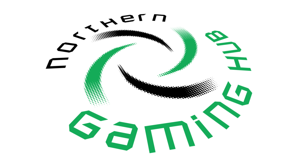
Huh. That’s got something going on. This one cried out to be angled and not viewed head on… much like the view of a spiral galaxy through the Hubble or James Webb telescopes.
Could it be further refined? Certainly.
Is it worth my time to slave over the logo to a small business that went bankrupt decades ago? Ehhh, not in and of itself, although it certainly has an educational value here on my blog. I’ll leave this here as it is for now, and maybe I’ll return to it in time as new ideas strike me. That is the whole point to this section of the blog, after all.
Hmmm… there you go. Though now I find myself increasingly less enamoured (or would that simply be “decreasingly enamoured”?) with the Glue font I used so liberally on these pieces.
Ah well. That’s a redesign for another night.