The “Survivor” Fundraiser
So this has evolved into a fun little piece, but it actually started out kind of rocky.
When BBBS approached me to do it, Covid had just hit and had shut down the Bowl For Kids Sake annual fundraiser that they’d been relying on. When they told me about the Survivor fundraiser, with the prize being… beer… my first question was, “Uh, is this a drinking contest?”. Turns out, I’m not always the brightest carrot in the egg carton. Also turns out I enjoy mixing metaphors. But that’s neither here nor there.
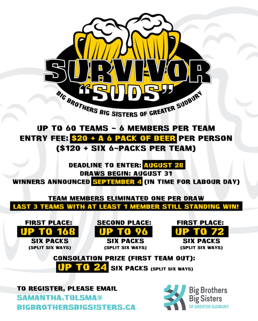
Not a lot of visual pizazz here. A bit of a step down after the delightful visuals of the bowling themes, but it seemed like it was more important to get the rules out there. Plus, what was I going to do, show pictures of kids drinking beer? It was enough that I got a couple sudsy mugs in the logo. And speaking of “sudsy”, the title was mine, and it was a bit of a double play on words – in our area, beer is sometimes referred to as “suds”, cause the foamy head looks like just that. Plus, Sudbury itself is sometimes referred to locally as “Suds”. So… yeah.
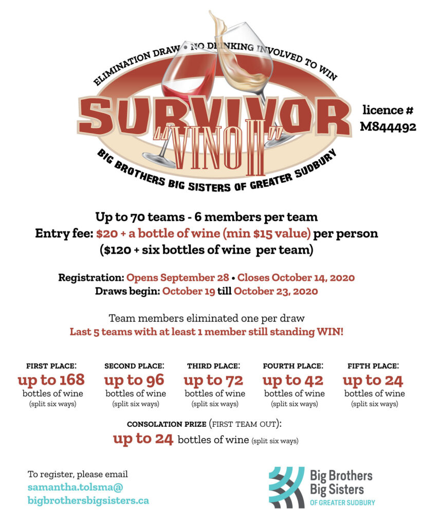
Next one they moved on to wine. Survivor Wine had no particular ring to it… but make it a bit pretentious, and Survivor Vino (and its follow-up Survivor Vino II) had more of a vibe. Still no sign of the kids here, but hardly inappropriate given the prizes involved. Still, not terribly visually fun, as we were still more focused on getting the rules out there. Keep in mind, this was mid-pandemic, and everyone was stuck at home, so it was still a popular prize.
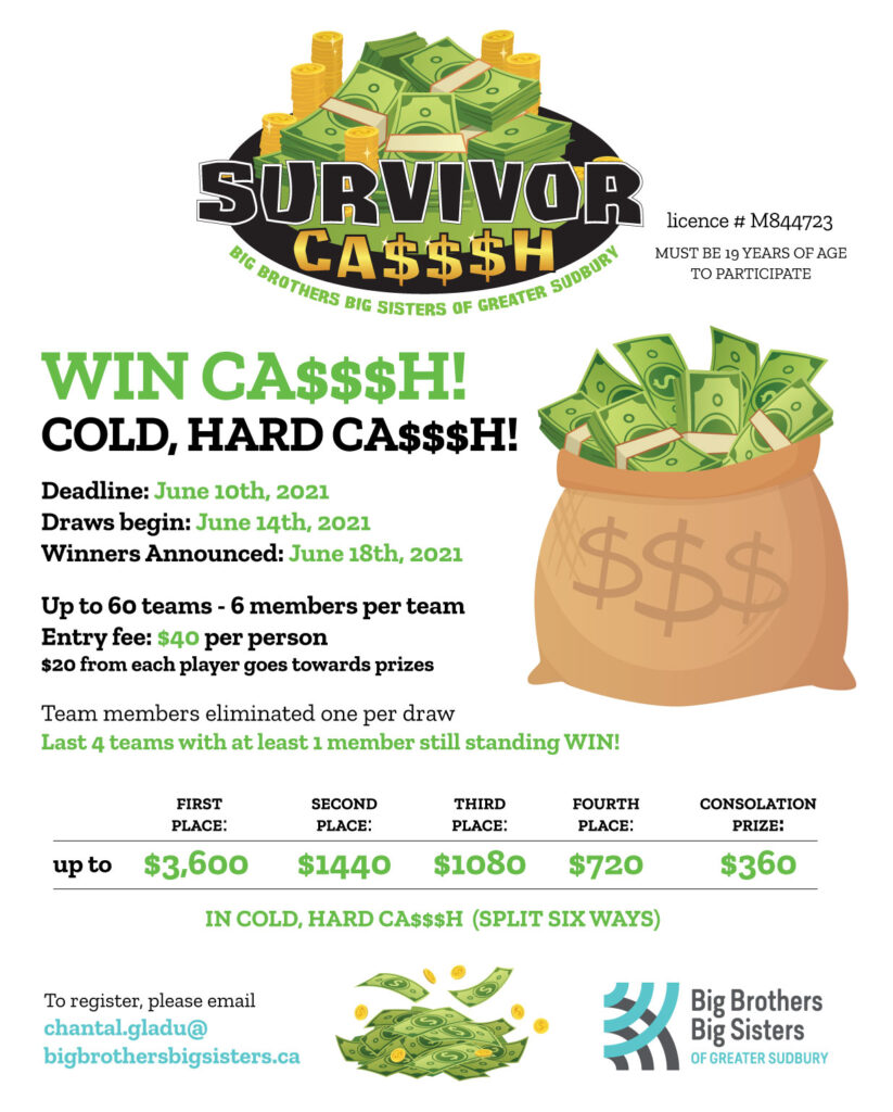
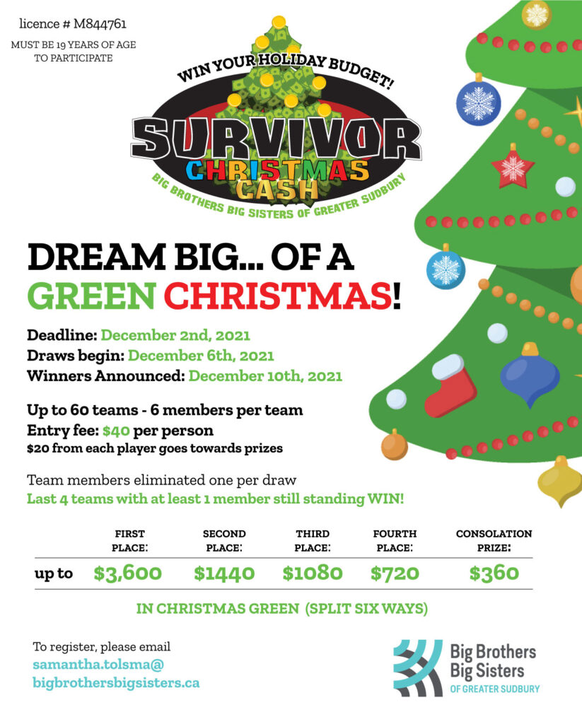
They moved on from beer and wine (storage was an issue, and they weren’t blind to the fact that fundraising on alcohol was a bit contrary to the agency’s mission to help protect vulnerable kids from futures that would include drug and alcohol abuse. So, we focused on Christmas and money. Started easing back on the rules focus and playing more with visual. Really just some stock stuff found on Shutterstock. Of course, the titles were my fun. CA$$$H! So obnoxious.
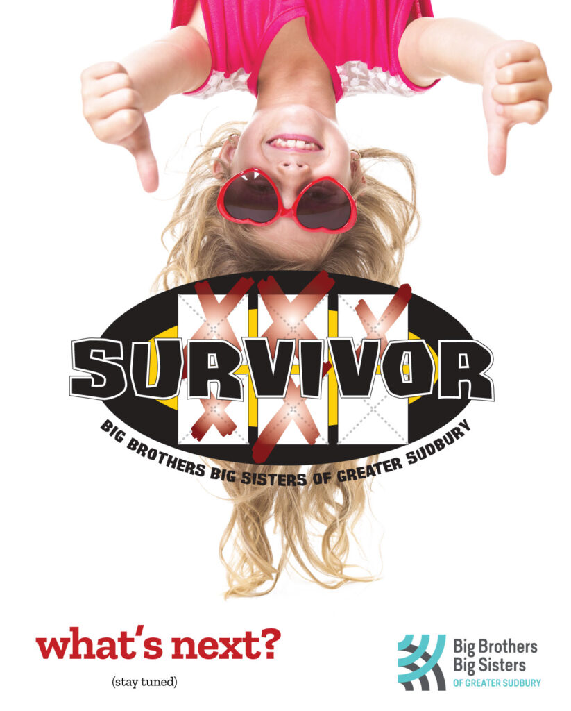
It was at this point where I decided it was time to get the kids back in the picture. I revamped the header to get rid of the cartoony representations of the prizes and incorporate more the “be the last one standing” concept of the elimination draws, and started pulling in adorable kid photos from Shutterstock. I believe it started with a teaser image….
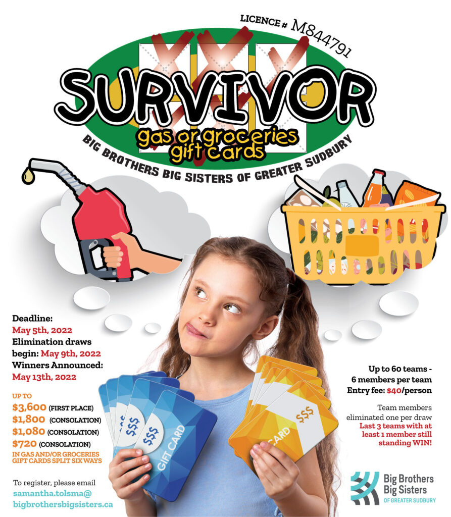
I’d then go all in with the kids and change up the font used in the logo to reflect that. Sometimes the perfect photos just fall into your lap. Or you have to purchase them. This was a purchase. But it still worked great. In the old days I probably would have gone out of my way to generate these images, the gas and the groceries, from scratch, using Illustrator to custom-make them… but man, if you’ve got a Shutterstock subscription, why would you want to? There’s a time and place to pour hours into custom graphics, and this wasn’t one of them.
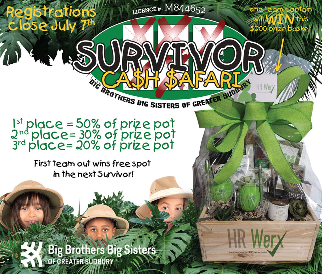
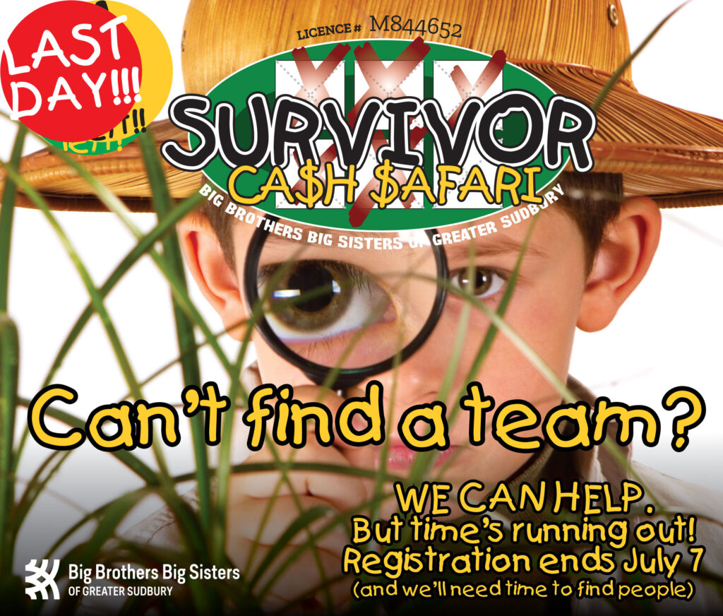
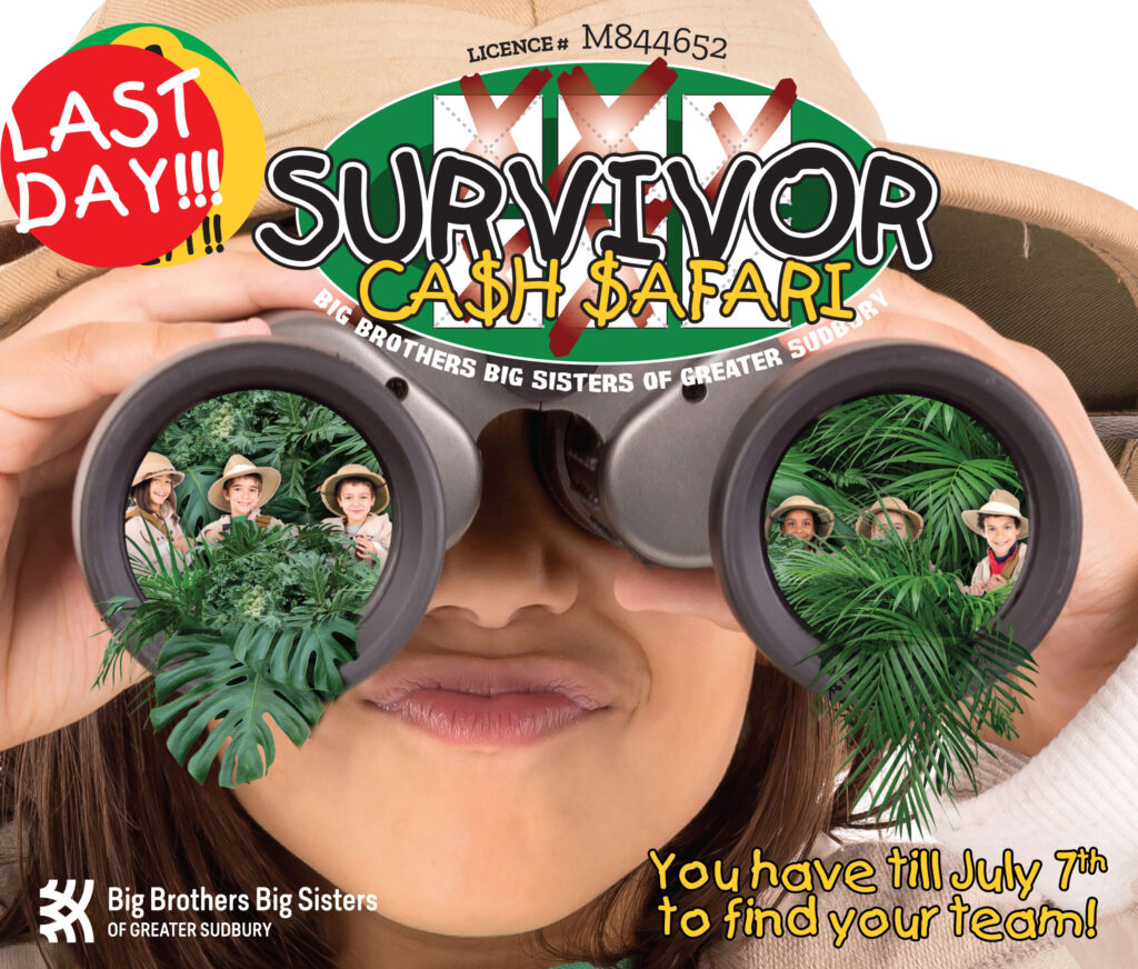
Next up… the Cash Safari. The organizer had actually had in mind more of a “luau” concept when she pitched the concept, but it was such an informal brief that I ended up running with the jungle and safari concept, which actually lent itself better to visuals than the luau beach party idea did. There was simply no way to use kids to render that idea. They were dead set on the prize basket being a dominant image in the promo stuff, so the focus ended up being different than I would have done without it. Sometimes you just make your compromises and move on.
I actually got to have more fun with these “Last Days” promos, which let me play more with dominant central images and visual metaphors.
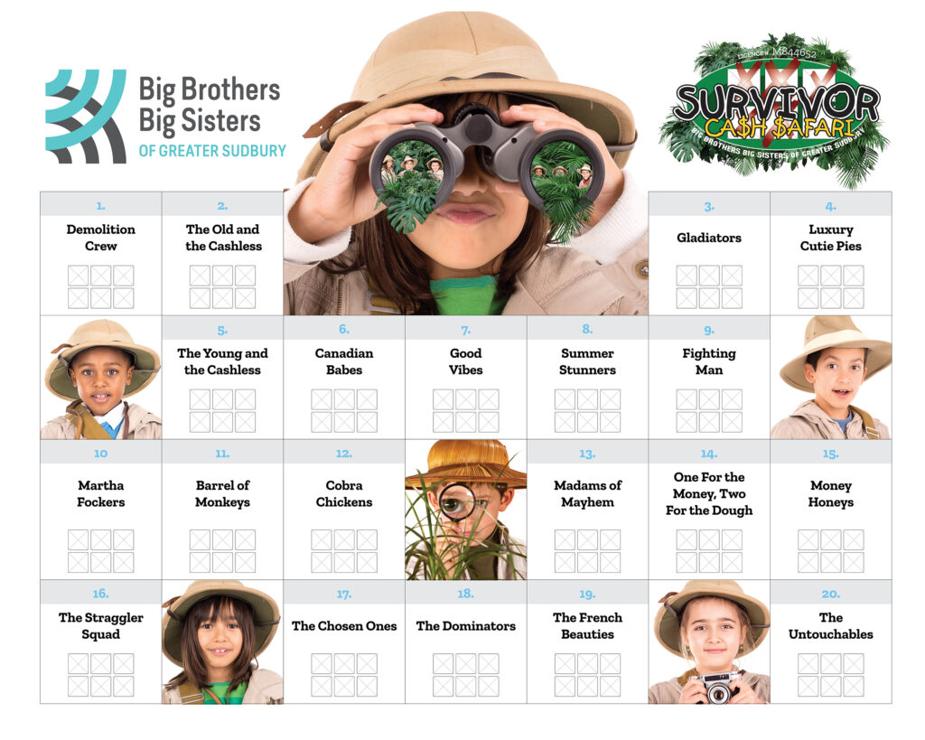
Had some fun with the elimination board. What I try and do is tie the board in with the visuals, and utilize as many thematic kids pictures as possible to fill in awkward gaps. It’s not going to make a difference to sales at this point, but it helps tie it all together.
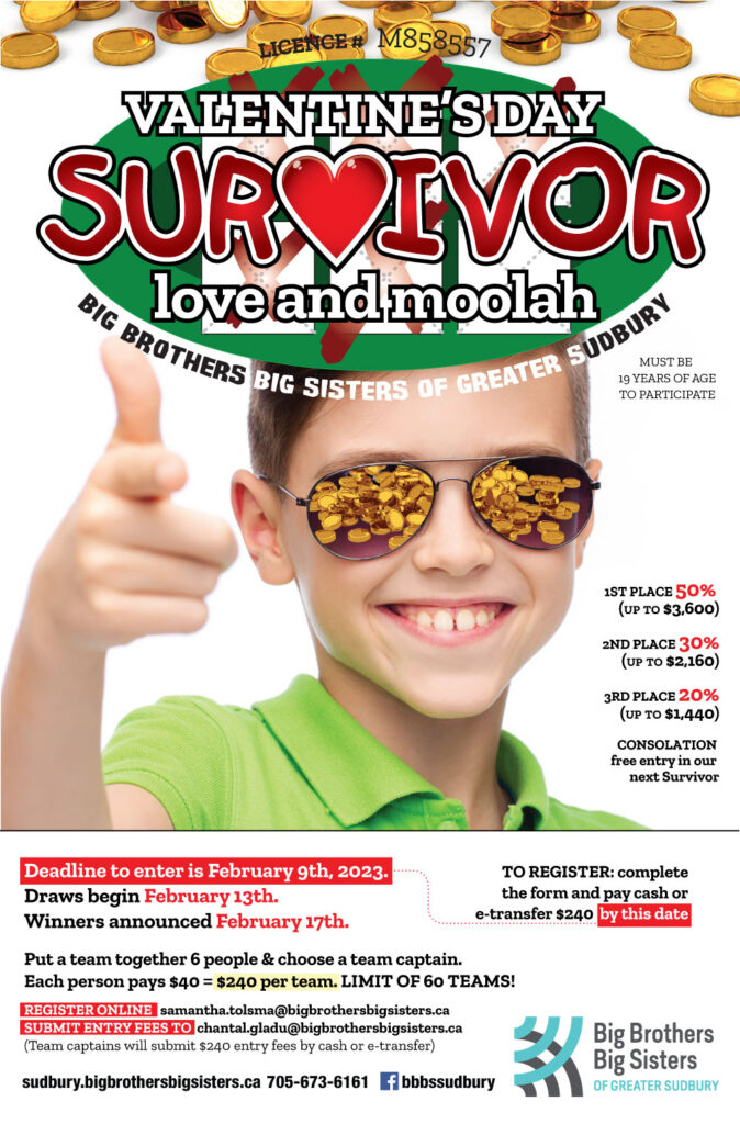
Ahh, Valentine’s Day. L’amour. Love and money. Or “Love and Moolah”, which was a little bit more fun. And that smug little twerp in the aviators. I’m a big fan of recycling – I’d purchased the gold coins image for a personal project and realized it’d be perfect for this. A bit of an evolution here in how we presented the rules and the prizes, which let me shunt all that stuff to the bottom or the periphery without cluttering up my central imaging.
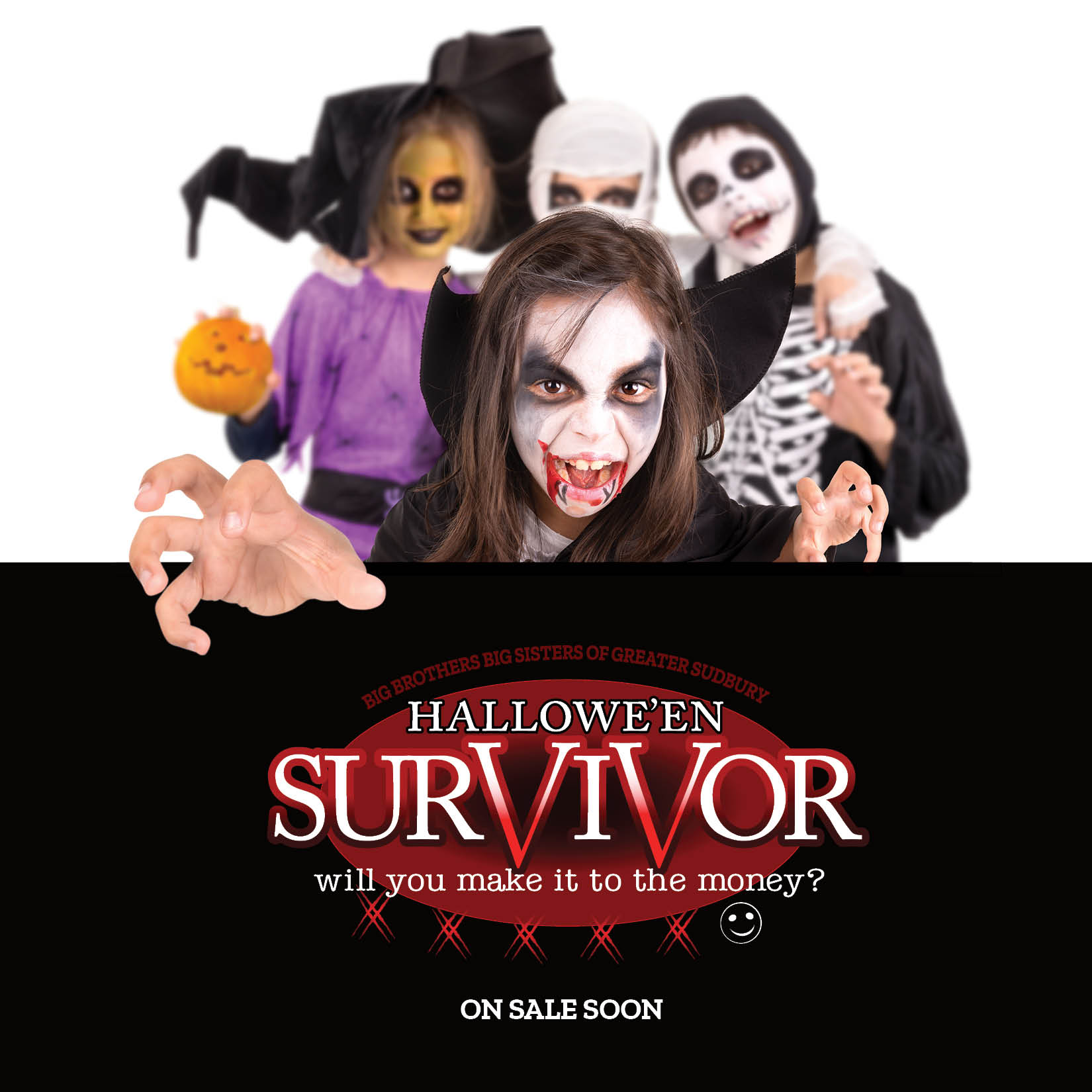
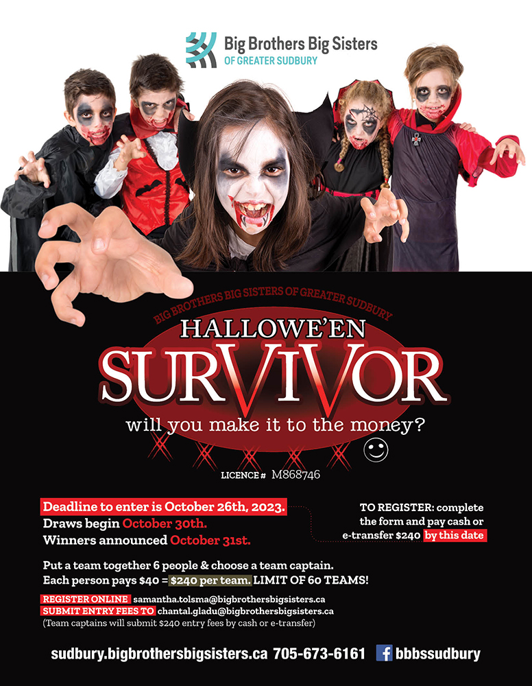
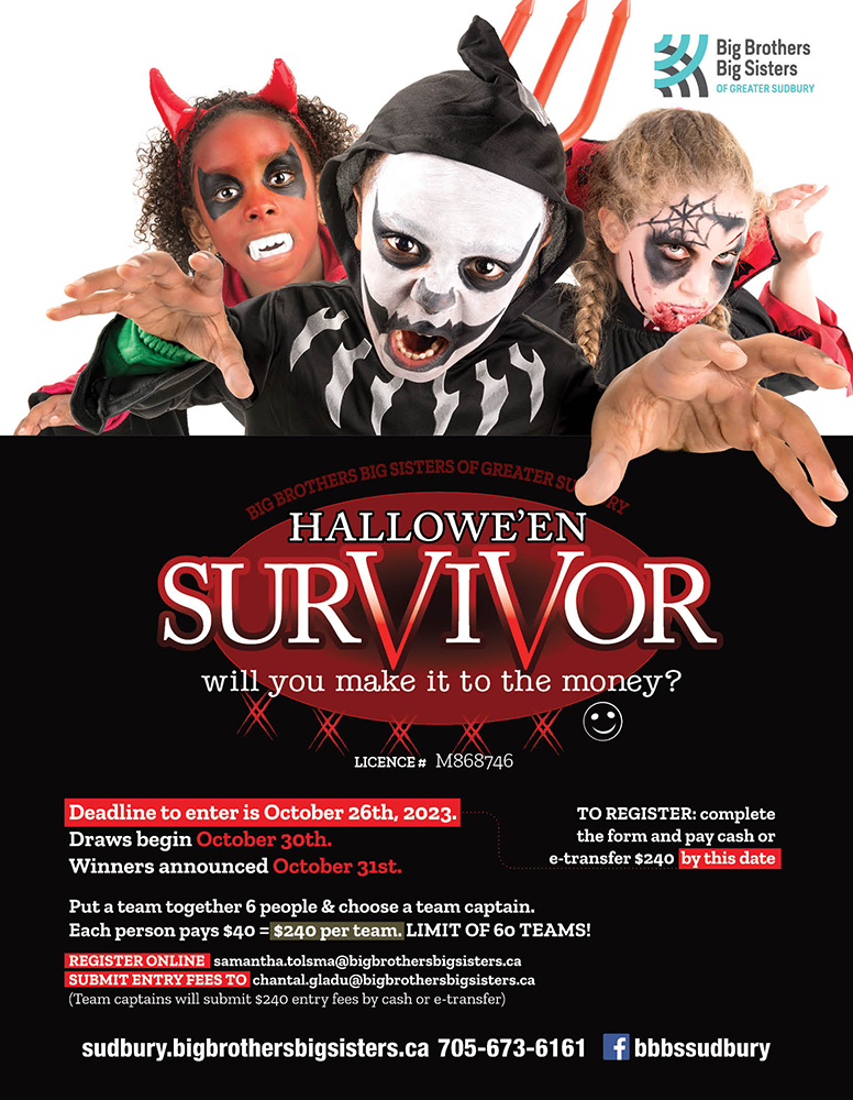
The Halloween fundraiser actually got its start during the summer, leading into the fall when I was putting the final touches on the BBBS magazine. They’d given me a page to promote myself and the artwork I do, and I ended up using the whole spread as a more imaginative break in the magazine. Two pages of fun, as it were. I played with a concept I discovered years ago about having elements break the frame and look “3D” in the process. The girl vampire’s hand was normal sized originally, but it looked like it was leaping off the page here, especially with the magazine’s page turning functionality. I rather enjoyed not having to include all the details, and just focus on the imagery, but that wouldn’t fly for the official poster/ad.
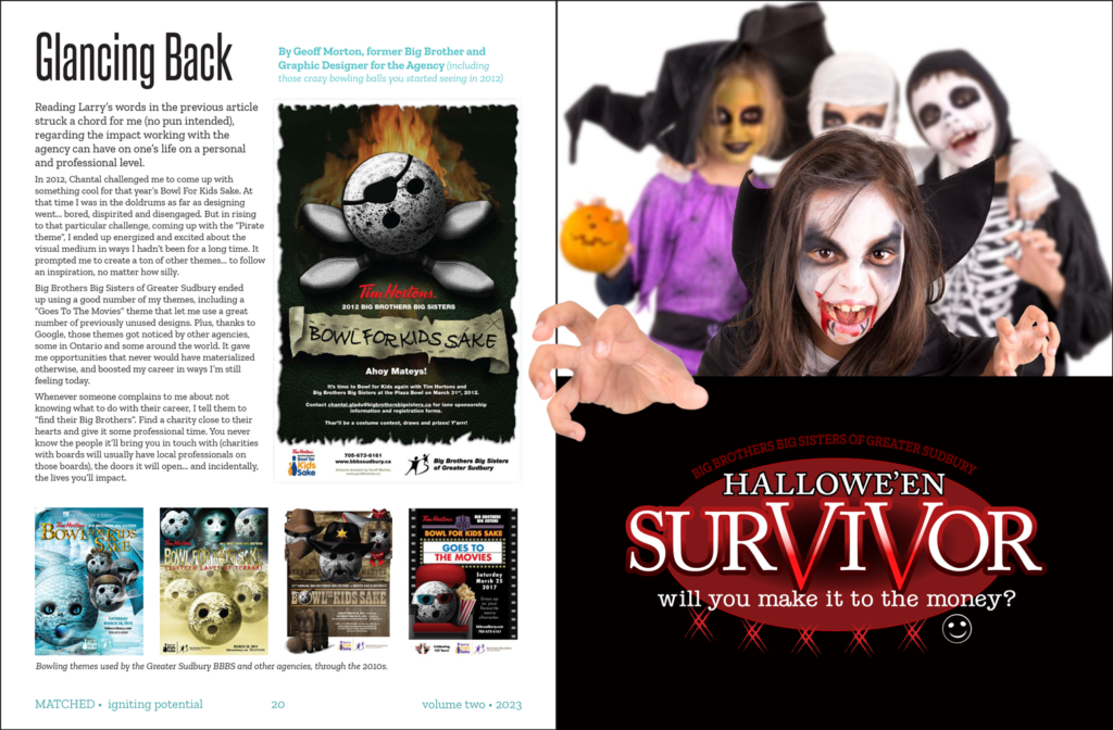
Whenever possible, I like to have multiple postables following the same visual theme so they’re not just constantly posting the same image over and over again.
This was a heartbreaker. We actually almost were able to launch the fundraiser on… get this… Friday, the 13th of October. I’d prepped the graphics and everything. Unfortunately the lady who would get us the license couldn’t do it till the next week, so that never happened. But… so close!
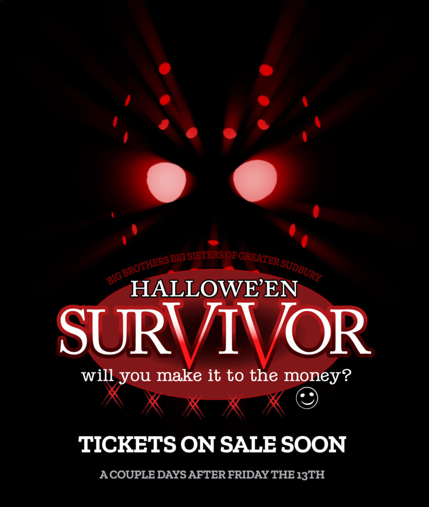
So close!