The Hub pt.3 – Play Time
In my previous two posts I explored a reimagining of the Northern Gaming Hub logo. (first) (second)
Now I turn my attention to the main poster I created for it, even if I haven’t completely cracked the logo. I imagine this will be something of a leapfrogging process as I tackle what I feel like tackling at any given time. It’s not like there’s a deadline or client expectations at play.
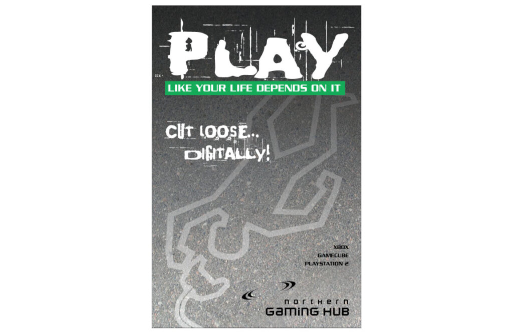
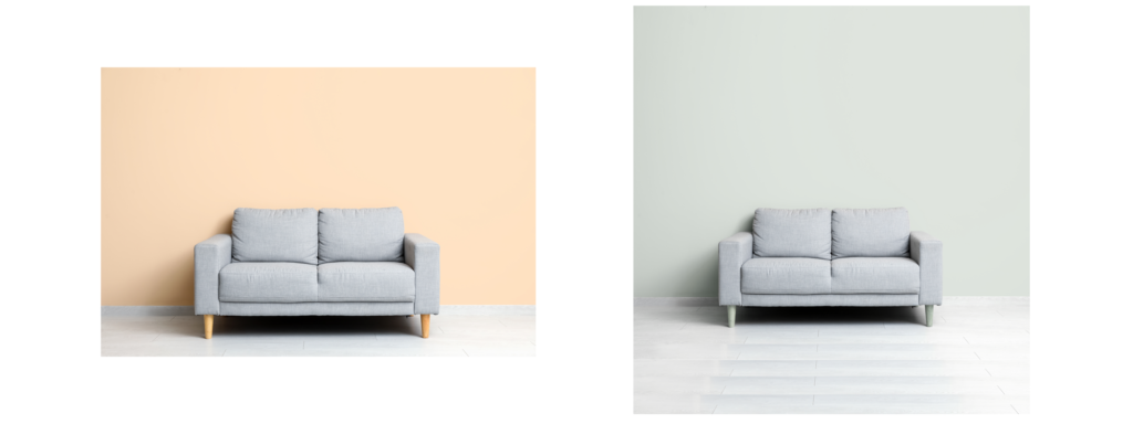
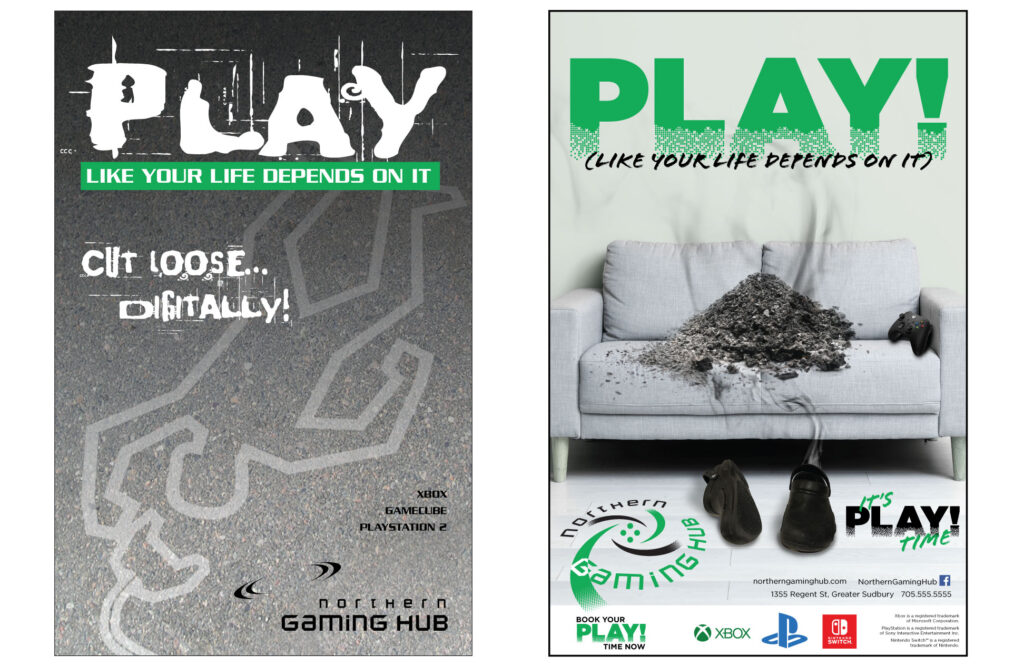
So, this is where it started. “Play like your life depends on it”… I thought that was fun. It captured the intensity of a multiplayer match. “Cut loose… digitally”. It felt cleverer at the time than it does now. I thought the chalk outline was fun. I’ll tell you something, though… that pavement… it was not my first choice. I originally envisioned a couch with a chalk outline of where someone had been, where their life depended on their skill playing. However, this was in the days before I had easy or cheap access to stock photos, so I had to take them myself, and I didn’t feel my couch at the time was terribly photogenic, so I just went with the pavement. In hindsight, I think I missed out on some impactful imagery by skipping the couch. So… when it came time for this, the first thing I did… find a quality photo of a couch.
Once I laid it in my image, I realized several things. 1. I needed more height above it. I needed more height below it. Above would be easy to add. Below would require some awkward duplicating of the little bit of floor panelling available. Once that was done, I needed to change the colour and saturation so that it felt like it belonged with my green and black logo. Minty green, I must say, is not my favoured background colour, but it would let the other elements push forward better.
The first thing I did in laying this out was reconsider the chalk outline. This was for several reasons. One, I was in a bit of a hurry and capturing the right pose and layout was going to be time consuming. But given the hours I knew I was going to pour into this, that wasn’t quite right. Fact is, the chalk outline felt a little too real, like an actual murder scene, and not as fantastical and reality-heightened as a videogame “death” should be. So, I opted for a pile of ashes on the couch instead of the chalk outline. A big fan of recycling, these ashes actually came from some Dungeons & Dragons themed merch I’d created.
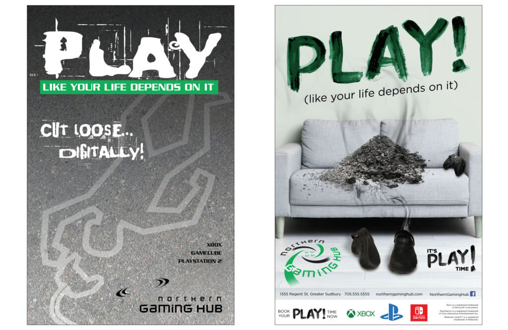
Yeah, I said something about the chalk outline being too “real”? Well, the Red John style “PLAY!” fingerpainted on the wall made a total lie out of that one. I realized really quickly that that really wasn’t serving that elusive vision I had flitting around the corners of my mind. Also, since I was junking “cut loose… digitally” in favour of “It’s Play Time!”, such an organic headline really didn’t suit at all. It needed something tying in that digital element.
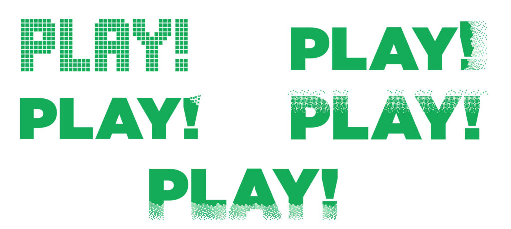
As I mentioned, I played with some different approaches to digitizing the “PLAY!”. Some, like the upper right with the effect on the exclamation mark fading off to the right, play well against a white screen surrounding it, but didn’t work well within the confines of an actual poster or social graphic.
The LED-style version on the left came first, but it felt a little old fashioned. Also reminded me of some OLG advertisement I recalled seeing somewhere, sometime. It also didn’t scream modern high-definition pixelization, so I explored how I might show that better. I had an elusive vision somewhere in my head that I had trouble realizing. I do wonder if I should have the letters pixelizing off to the top instead of the bottom. Maybe something to try for another entry.
In the original poster I just listed the game systems by name. Now I would leverage the actual gaming systems by their brands (I modernized it though… where the original said Gamecube, I’ve got the Switch logo in here).
Back at the agency, I had to put together a lot of mobile phone brochures, and typically they were all of different makes and manufacturers. Most of them, whether they were Samsungs, BlackBerrys, LG or whatever, we could lump them on the same page and panel without issue. Buuut… not Apple. The guide I received from Apple stated quite specifically that Apple products could never be placed in proximity or even on the same panel as any other manufacturer’s product. So, the iPhone got its own panel.
So, for me, I have no idea if I could actually place the Xbox, Playstation and Switch logos side by side like that. Were I at an agency, I’m sure there’d be documentation letting me know whether I could or couldn’t. Were I doing this freelance, I’d have to do some research and maybe even get in contact with some customer services to find out for sure. But, for these purposes, I’m just pretending it’s fine. Even if I know it could actually be a minefield were this an actual advertising piece. Just one of those things you have to look out for.
Mucked with the logo a bit again. Turns out that some visual metaphors fall apart when you treat them literally. In this case, by including the four buttons in the angling effect, they actually lost their visual representation and just turned into four random circles. So, they’re not included in the angling effect anymore.
So… yeah. Here we are with this. Still room for more (yep), but this does serve as an exploration of then and now and how I might do some things differently. It’s been twenty years. I certainly hope I would. 🙂