The Hub pt.4 – Closing the Circle
Creativity is a double-edged sword. Constrained too much by commercial and productivity constraints, you’ll lose the opportunity for the exploration that could lead to some really imaginative results that could connect you with your target audience. Unconstrained by any constraints, and you’ll find projects that expand to fill the space and time available, fun for the creator but really risking endless rabbit holes and left turns in the name of exploration.
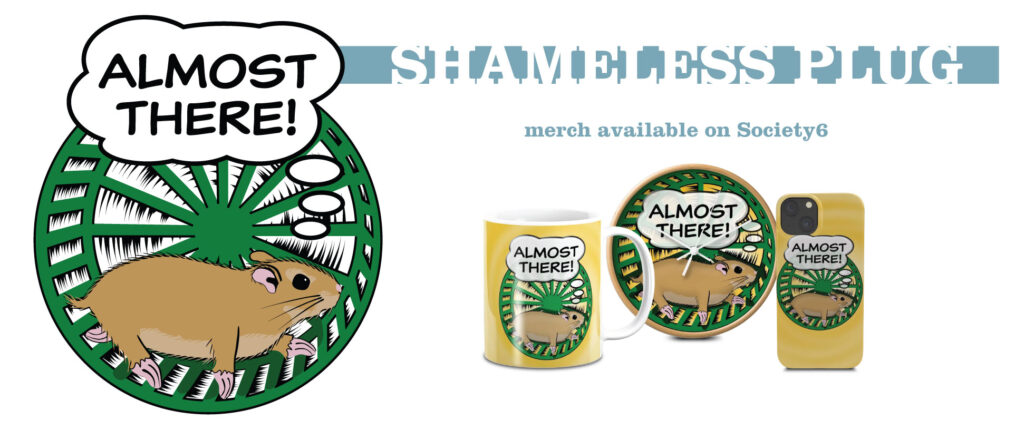
When it came to this little project, I thought part 3 would be a good stepping off point. But the hamster wasn’t finished…
Ahem. Anyway.
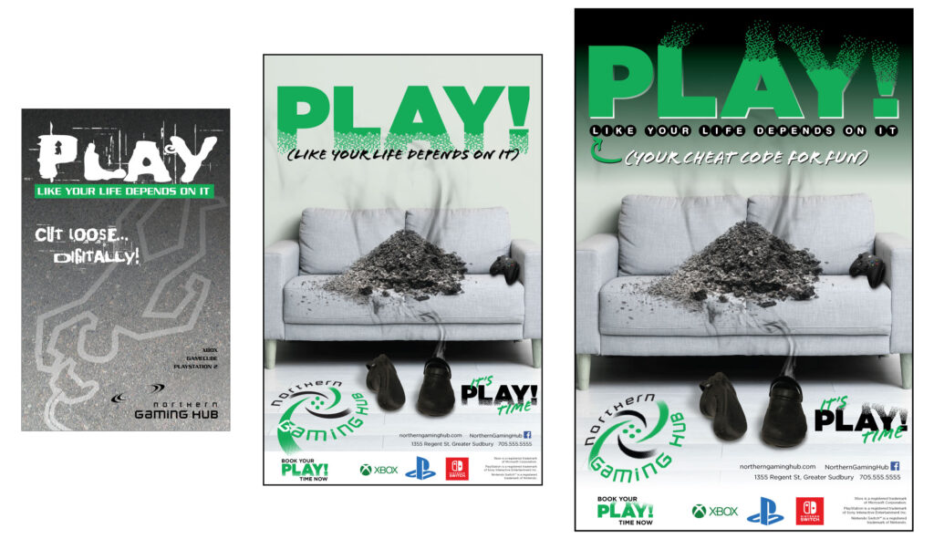
Some things gnawed at me. Firstly, I was getting frustrated that I never quite realized the PLAY! digital disintigration effect I had envisioned. The “Thanos Snap” effect, if you will. So, I took one more stab at it, and it came in close to what I’d envisioned.

That’s more like it. Then I thought… did I really capture all I wanted with the “like your life depends on it”? Cause all I did was use a scrawly font for the phrase. What if I… did something videogamey? And then I thought… yeah… what about the up/down/left/right arrows that show up in guides for cheat codes. Now, I didn’t literally use arrows, but I evoked the arrow graphics that often appear in circles. The arrows themselves are typically rounded, so I used Helvetica Rounded. Again, evocation, even if not literal invocation.

TVTropes has a… well, a trope… called “Lampshading“, wherein you acknowledge something you’ve done subtly, just to make sure they know that you knew what you were doing…

Was it a bridge too far? Maybe. It was one more element tying in with gamer culture.
Oh… forgot to mention, in my excitement to jump right into “PLAY!”, that I went back one more time and worked the logo. I took what I liked about my original rebuild, added what I liked about the rebuild of the rebuild, and just streamlined it to make it what I would have been confident showing to a client.

Time to bring it all together. Took another look back at the original and asked myself what truly worked about it, and realized that the shading from the top really helped push the other elements forward. Added some drop shadows and drop highlights for some dynamic push and pull. Got rid of the white bar at the bottom in favour of a gradation to help reduce the claustrophobia down there.
And… here you go.

So… time to call it a day on this project. Even if it was a short-lived store, and even if I would not have a clue about how to market it today, as I don’t believe there’s much of a market left for gaming hubs, not with the ubiquitousness of gaming systems and mobile gaming… this has been a worthwhile trip down memory lane.
Hell, I got four blog entries out of it.
🙂
